Flowers by Lunelly
A responsive web redesign to help a neighborhood florist thrive in the digital marketplace.
Flowers by Lunelly, a family-owned florist in Queens (NY), had a lovely local presence, but their website didn’t reflect it. As a user, I realized I couldn’t do anything on the site. There was no way to browse confidently, build a bouquet, or place an order. And if someone outside Queens wanted to send flowers? The experience simply wasn’t built for them.
To understand the gaps more deeply, I conducted a competitive analysis of leading florist sites and identified several opportunities around navigation, product clarity, and checkout flows. I then recruited users with prior online flower-shopping experience and asked them to walk me through the current site.
Their reaction was consistent…they left with more questions than answers.
Discovery
How might we…
make it easier for customers, local and remote, to confidently browse, customize, and order flowers from a small local florist?
The Process
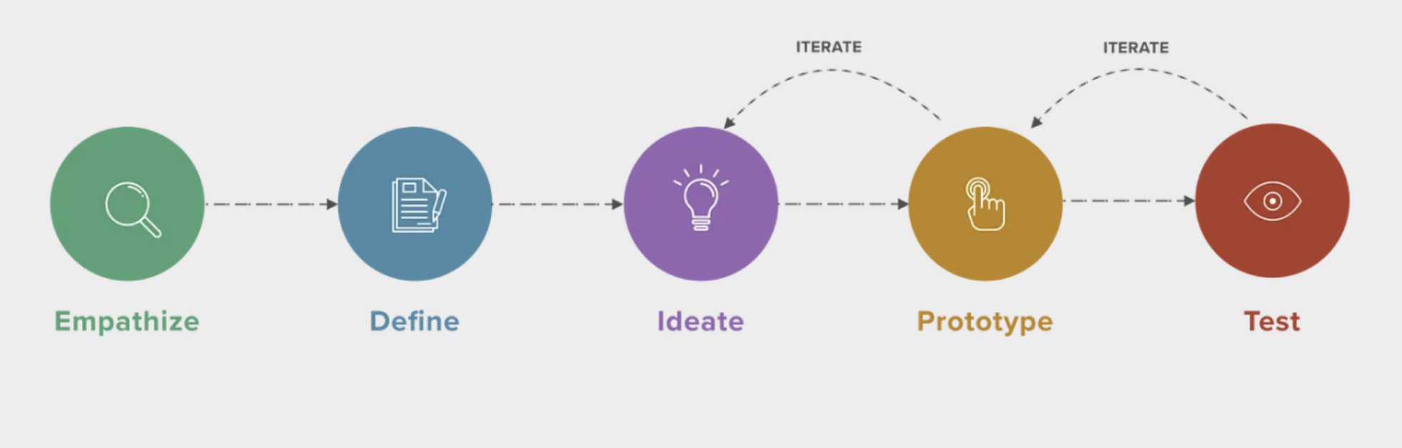
Empathize
Once users landed on the site, most weren't even sure where they were. Several unintentionally ended up on the About Us page, and from there the confusion only grew. The photo galleries felt disconnected—beautiful images, but no descriptions, no prices, no sense of what was actually available.
As users browsed, the same themes kept emerging:
Research & Insights
01
“What do they actually sell?”
02
“Where do I go to buy something?”
03
“Do they deliver?”
Key Findings
01
Pricing and availability were major points of frustration.
02
Users didn’t know what items they could purchase or whether anything could be delivered or picked up.
03
Users craved clear guidance and a sense of confidence throughout the journey.
04
The emotional experience of buying flowers—gift-giving, meaning, reassurance—was missing online.
These findings ultimately shaped the direction of the redesign, pushing it toward clarity, usability, and emotional connection.
Through extensive research, a clear picture emerged of Flowers by Lunelly's core challenge. While the florist's stunning visuals and distinctive brand personality successfully draw visitors in, the website itself creates a frustrating disconnect, leaving users with unanswered questions just when they're ready to make a purchase. This gap between beautiful first impressions and practical usability was actively undermining trust and limiting online conversions.
User Personas


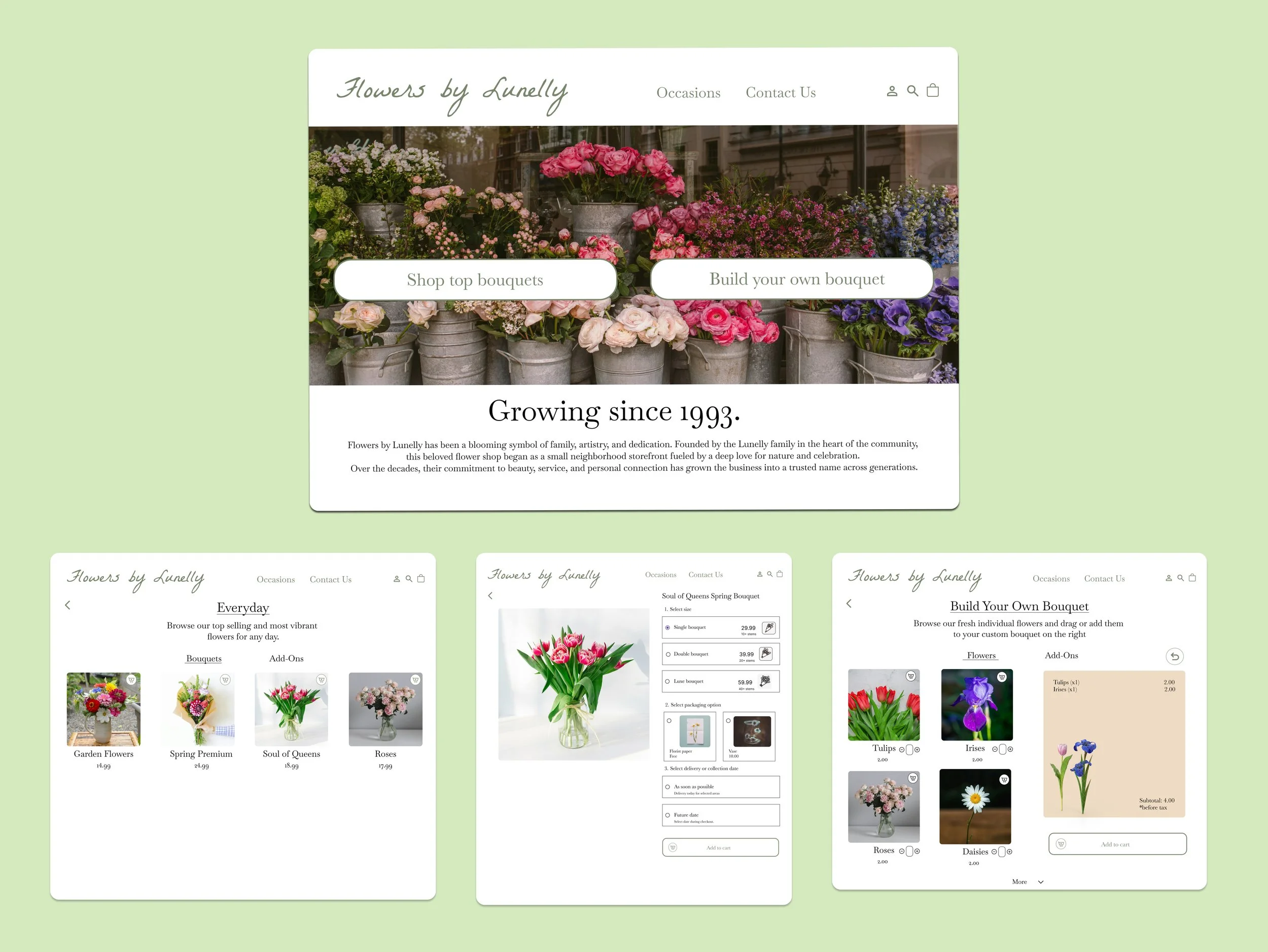
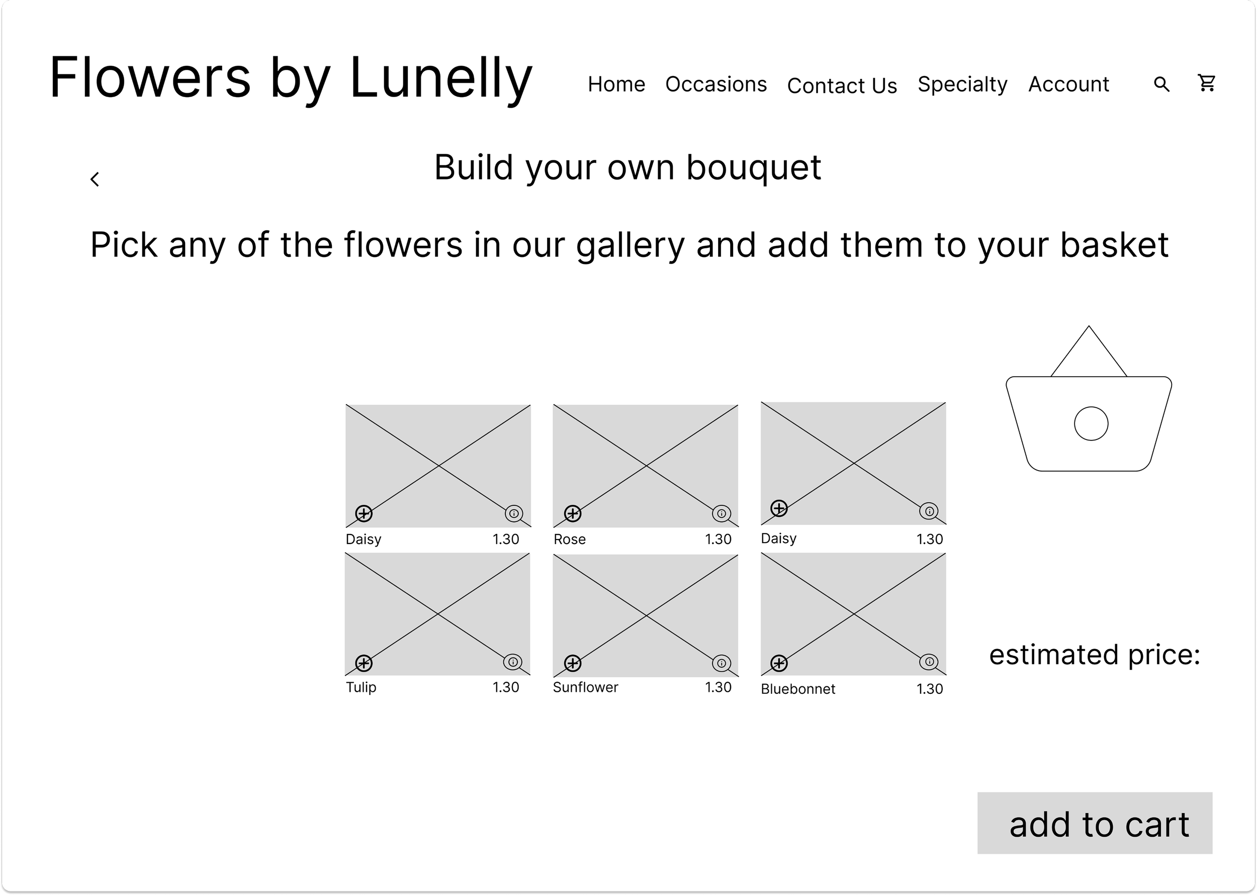
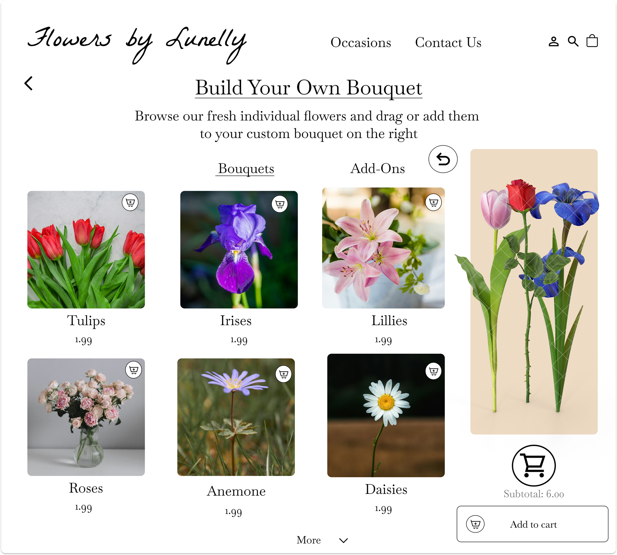
The research revealed two key user types driving the business: the sentimental planner, who values emotionally meaningful, personalized arrangements, and the aesthetic-first occasional gifter, who prioritizes visual appeal and quick, ready-to-purchase options. Recognizing these different shopping behaviors led to a full restructuring of the site’s information architecture, organized around clear user flows: Shop by Occasion, Build Your Own Bouquet, Delivery & Pickup Info, and About the Business.
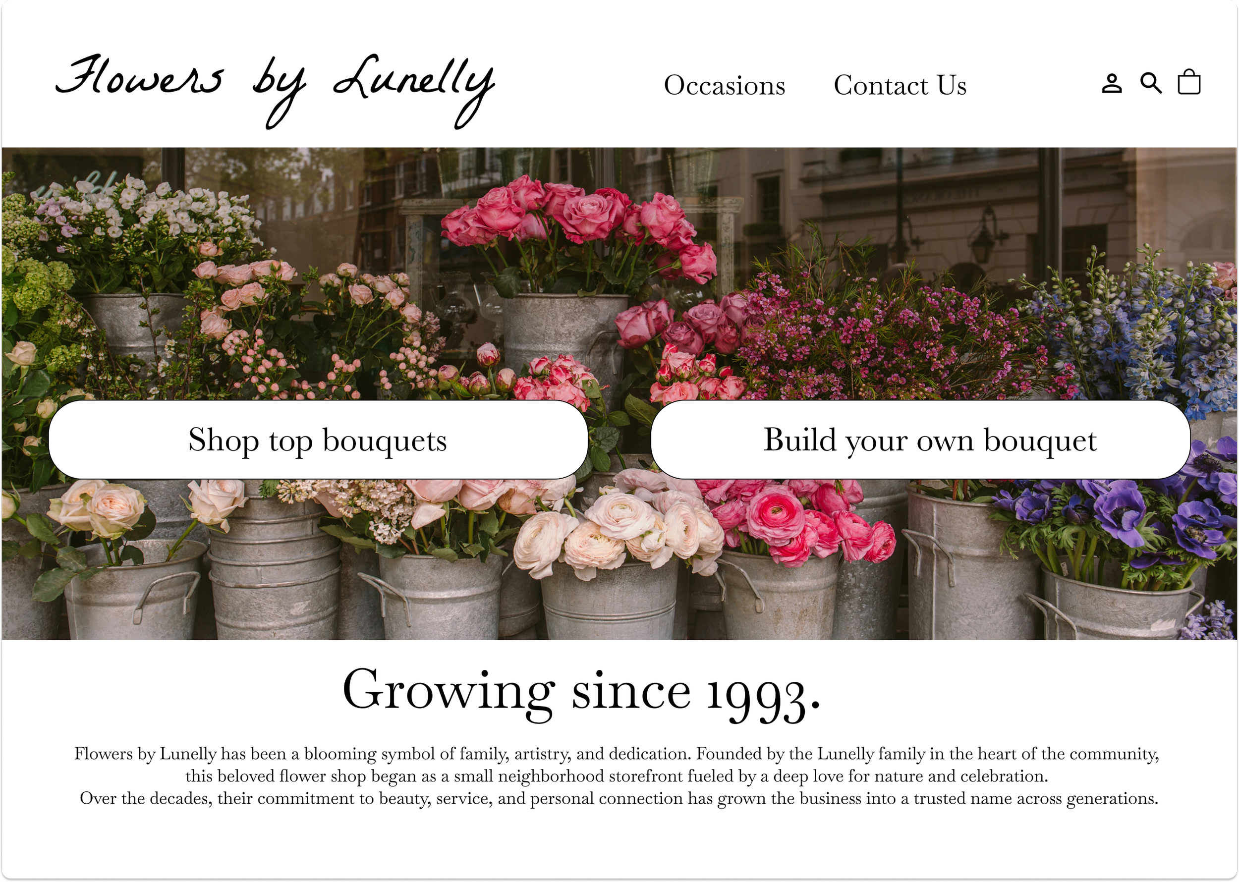
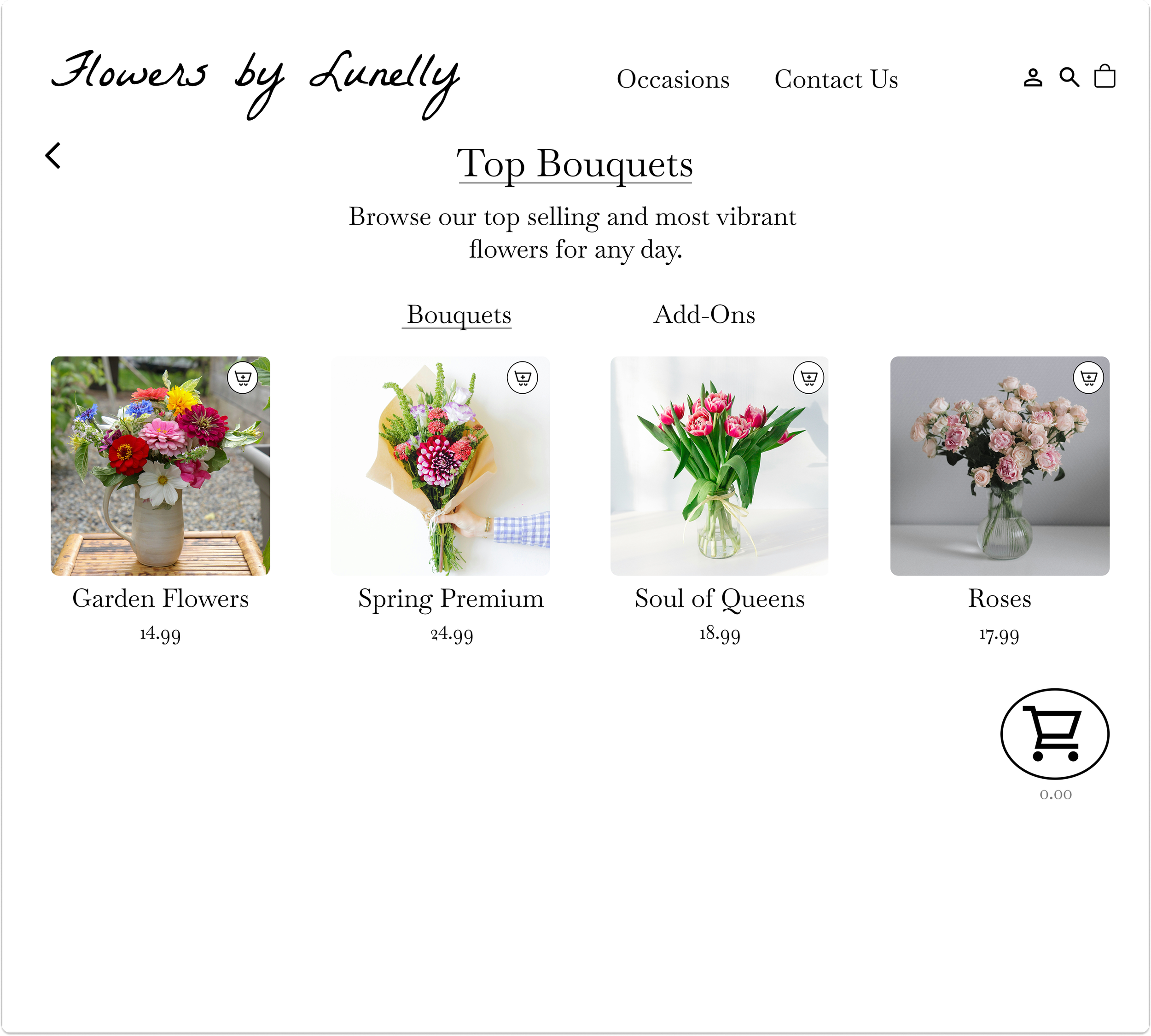
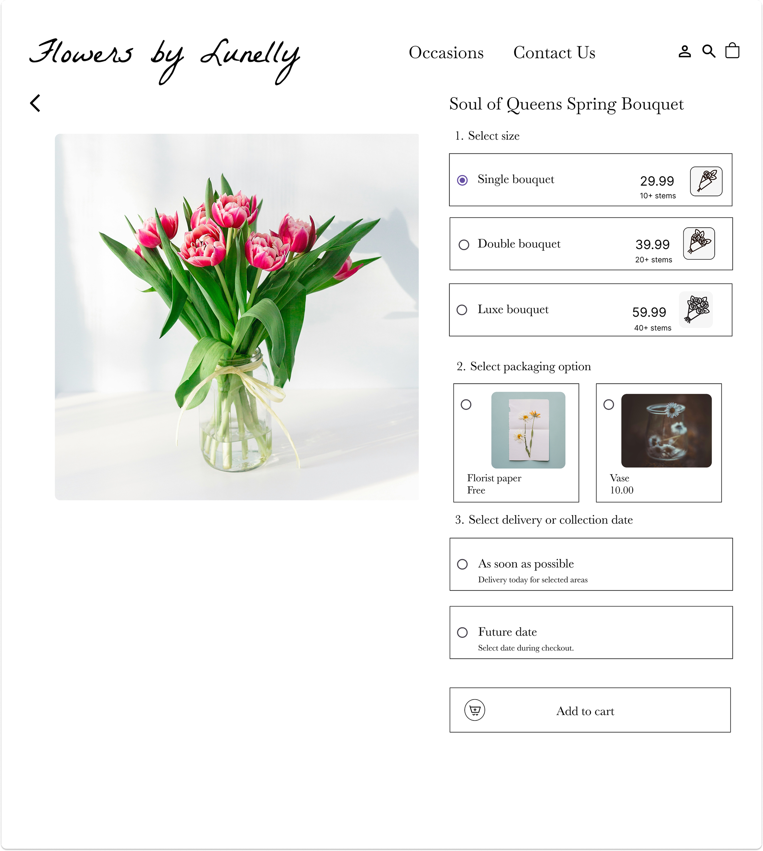
The design solution prioritized transparency and accessibility across devices. I created a fully responsive layout supported by inventory-aware product cards that surface pricing, availability, and occasion tags at a glance. A central Build Your Own Bouquet flow enables personalization, while delivery details are integrated throughout the shopping experience. To address trust and credibility, I introduced a dedicated business story section that showcases the florist’s personality and expertise, transforming the experience from transactional to warm and human.
Design Goals & Strategy
Define

Translating strategic UX goals into visual systems became the most rewarding part of the process. The visual strategy centered on creating an elegant, human experience through a soft pink and vibrant floral color palette, playful serif headers balanced with clean body text, and carefully curated hero shots that emphasized emotional connection over product photography.
The design evolved through iterative wireframing, starting with lo-fi layouts to test core flows, progressing through mid-fi iterations that refined the product cards and custom bouquet builder, and culminating in hi-fi designs that prioritized clean hierarchy, accessible typography, and mobile-first responsiveness. Each stage brought the florist's warm personality closer to the surface while solving the fundamental usability challenges uncovered in research.
The Re-design
Ideate
Prototype
Validation came through both moderated sessions and remote Maze testing, focusing on three critical questions: Could users easily find same-day delivery options? Did the custom bouquet builder inspire confidence? And most importantly, did the experience create an emotional connection?
The results were encouraging. Users embraced the Build Your Own flow but suggested clearer intuitive tagging like "Seasonal" or "Best for Birthdays" selected by the owners may help, or adding specific delivery windows like "Same-Day Available if ordered before 2pm”. Most rewarding was seeing users connect with the florist's story, which transformed their perception from transactional to personal, building the trust that had been missing from the original experience.
User Testing
Test
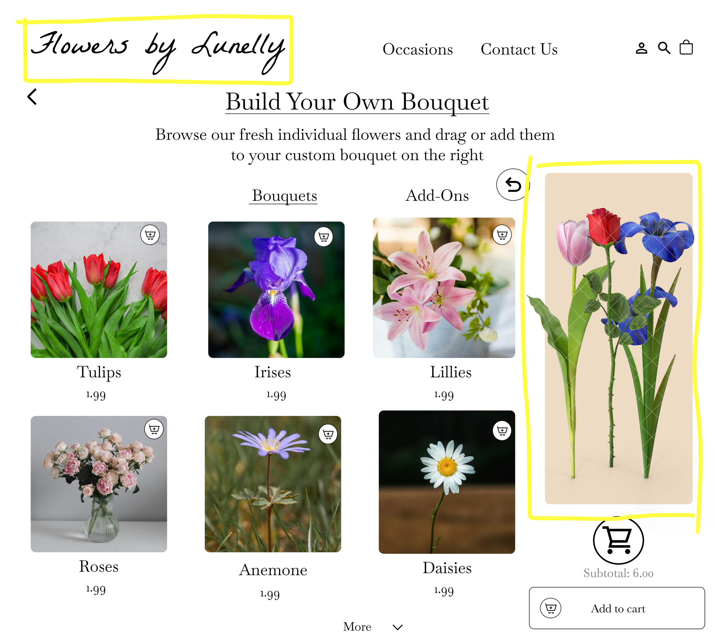
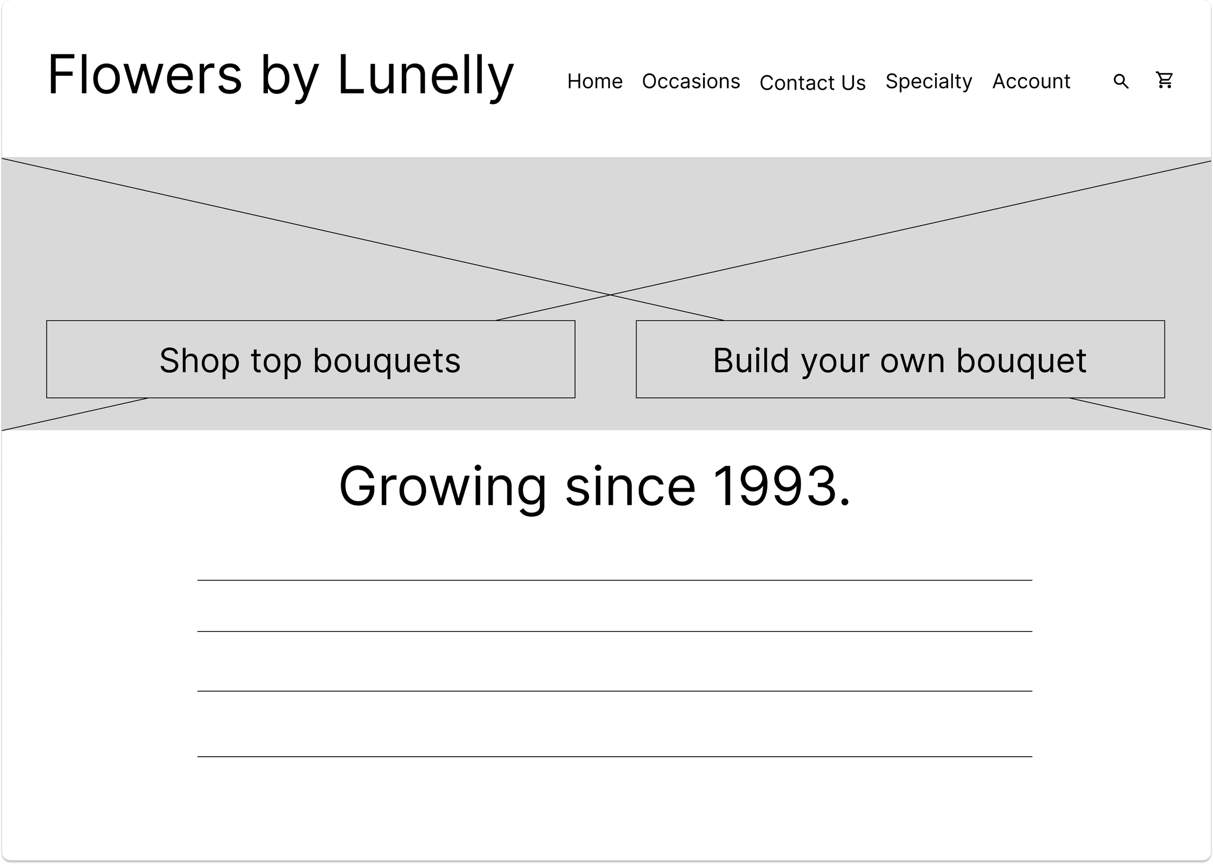
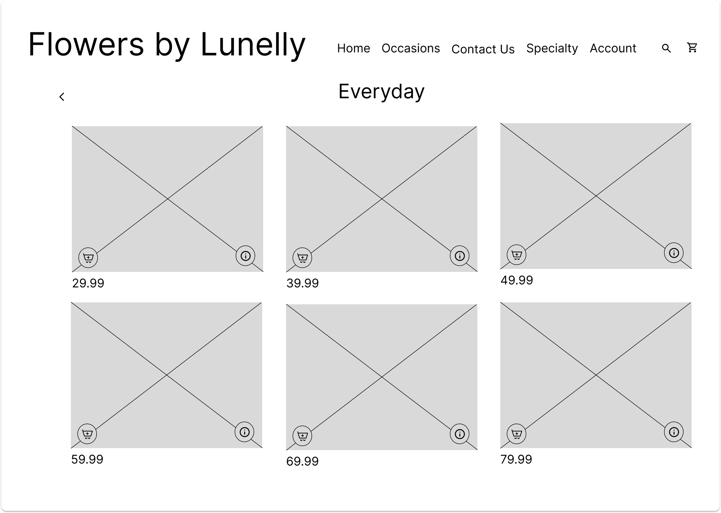
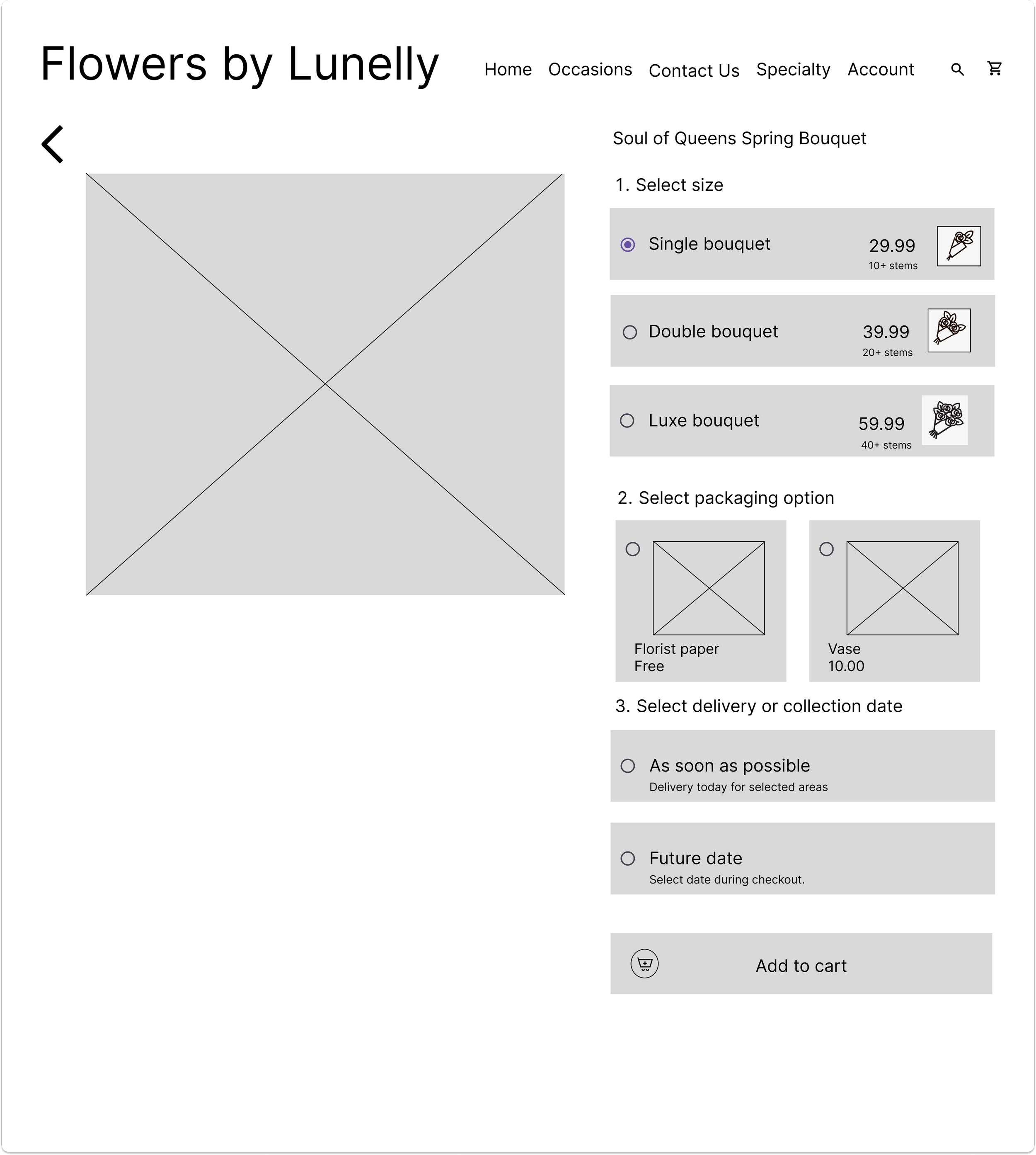
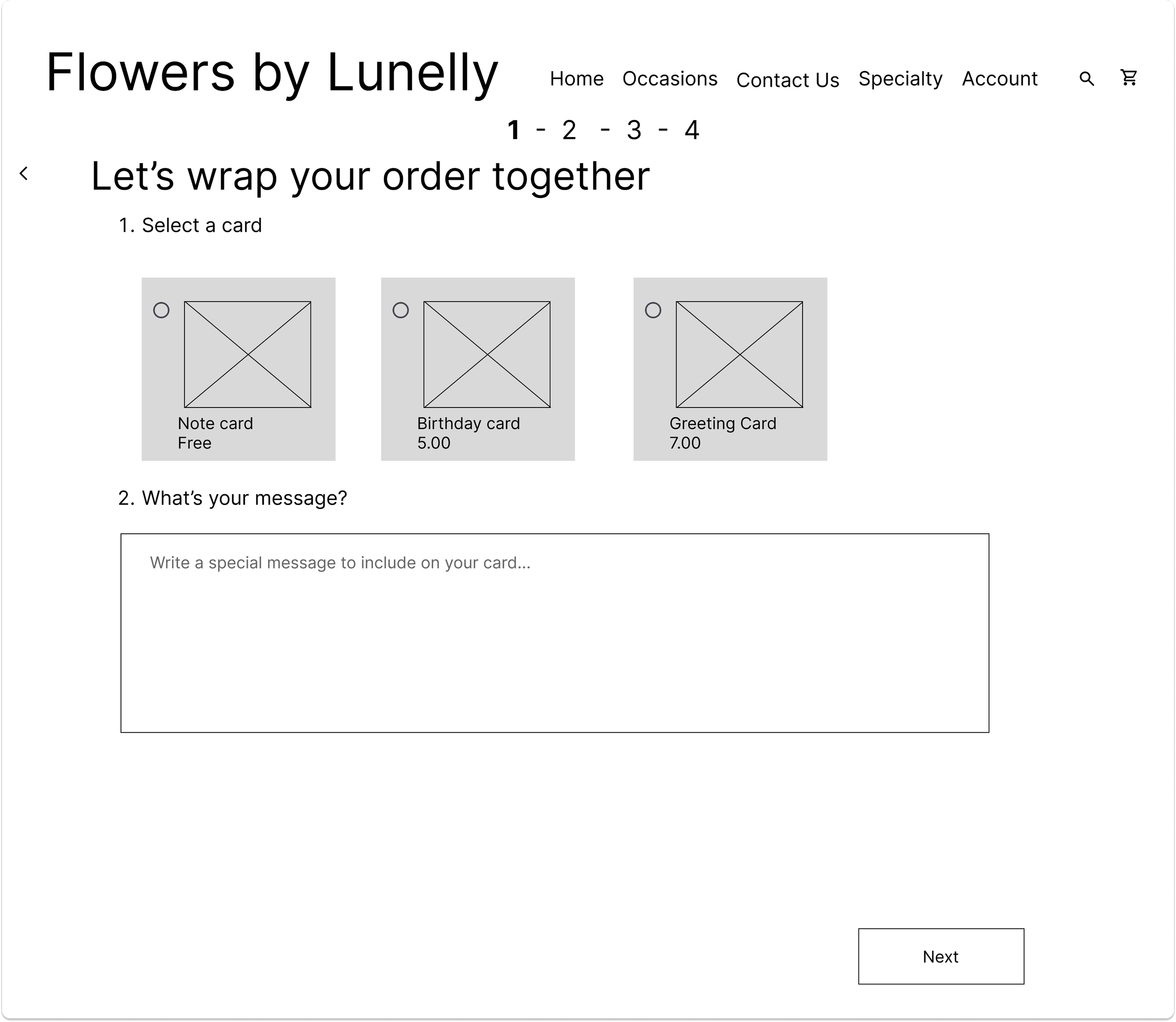
Before
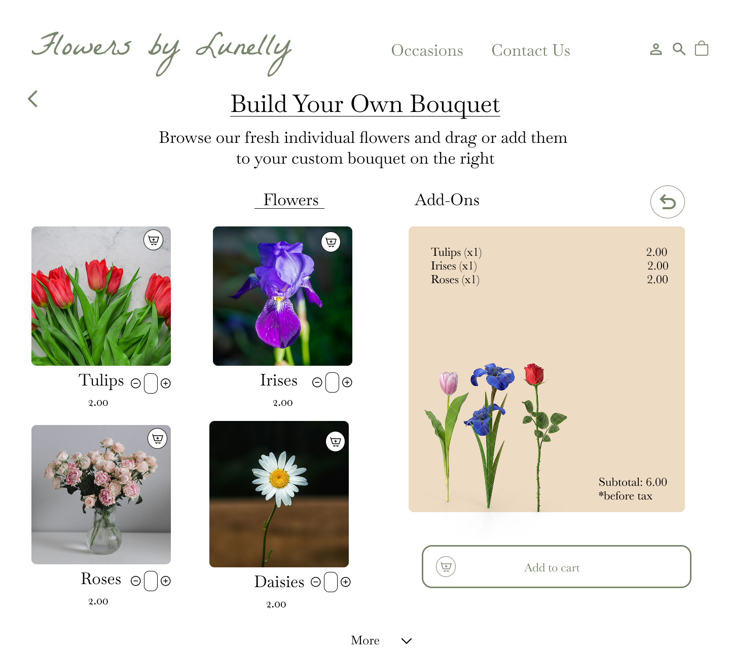
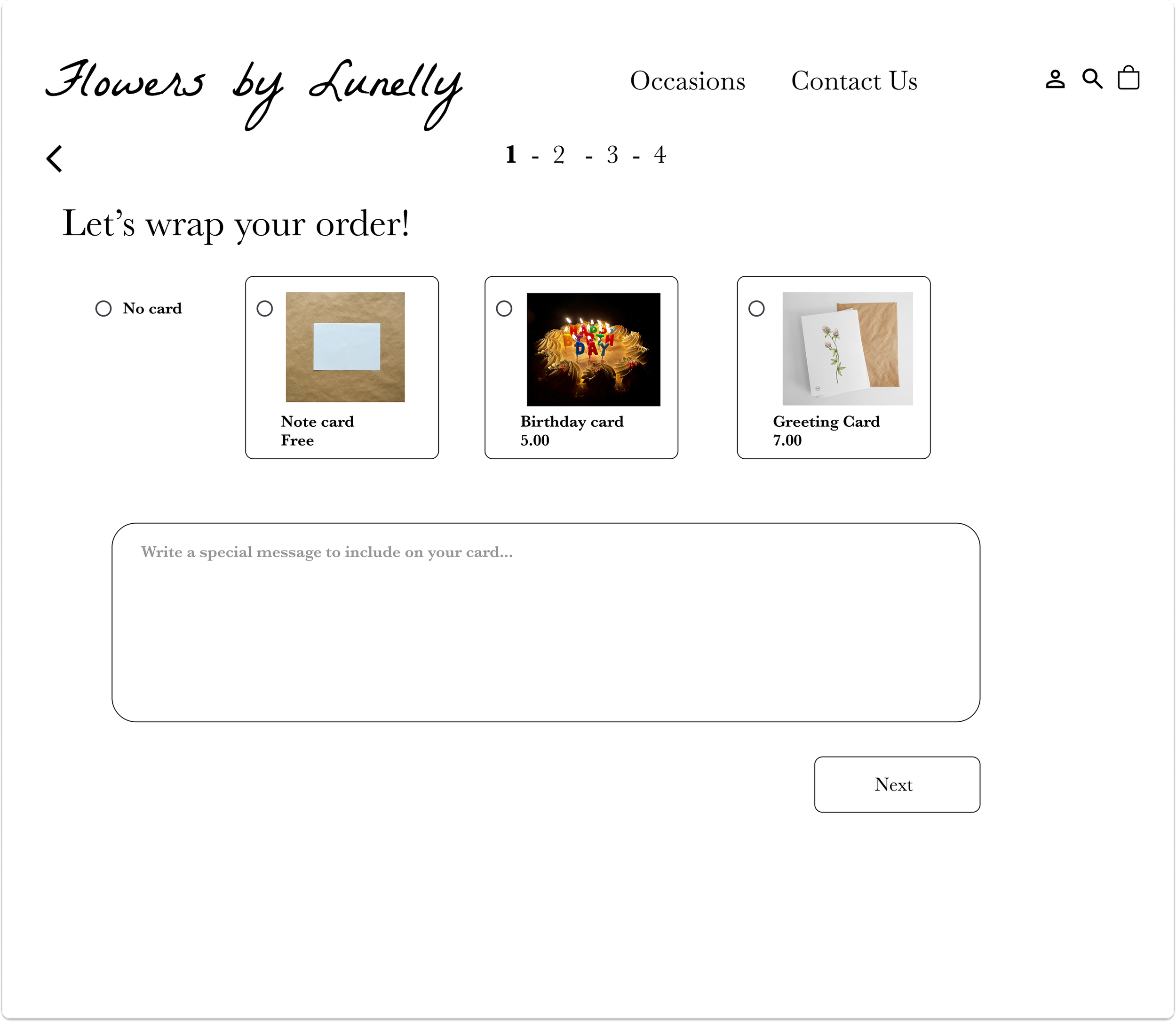
After
Final high-fidelity iteration.
The redesign transformed Flowers by Lunelly from a simple online shop into a comprehensive service experience rooted in trust, creativity, and emotional connection. The solution successfully bridged the gap between the florist's beautiful brand and practical user needs, creating pathways for both thoughtful planners and spontaneous gifters.
Moving forward, the focus shifts to implementation through partnership with the business on inventory and order management systems, rapid prototyping via Shopify or Squarespace, and future enhancements like personalization tools exploring flower meanings or zodiac-inspired arrangements. A delivery tracking feature would complete the transparency users craved, ensuring the experience remains seamless from selection to doorstep.
Thanks for reading!