Scout
An Apple Maps feature designed to help users discover nearby amenities that matter most.
Scout aims to help Apple Maps users make better-informed decisions while exploring their surroundings, by offering a streamlined way to view nearby amenities, evaluate locations and strengthen the Apple Maps ecosystem.
Discovery
You’re heading to a new coffee shop. It’s a 20-minute drive, or longer with traffic maybe parking is a mess too! But everything looks good on the map app: solid reviews, AC, open seating, even a bathroom. Perfect.
Then you sit down, take out your laptop…and realize the one thing you actually need isn’t there: an outlet. Small detail, but kind of a dealbreaker. And while you’re noticing that, the music suddenly feels way too loud.
Back to the map app you go, taking another shot in the dark. What’s the next place going to be missing?
The Process
How might we help Apple Maps users know the amenities that really matter before they show up?
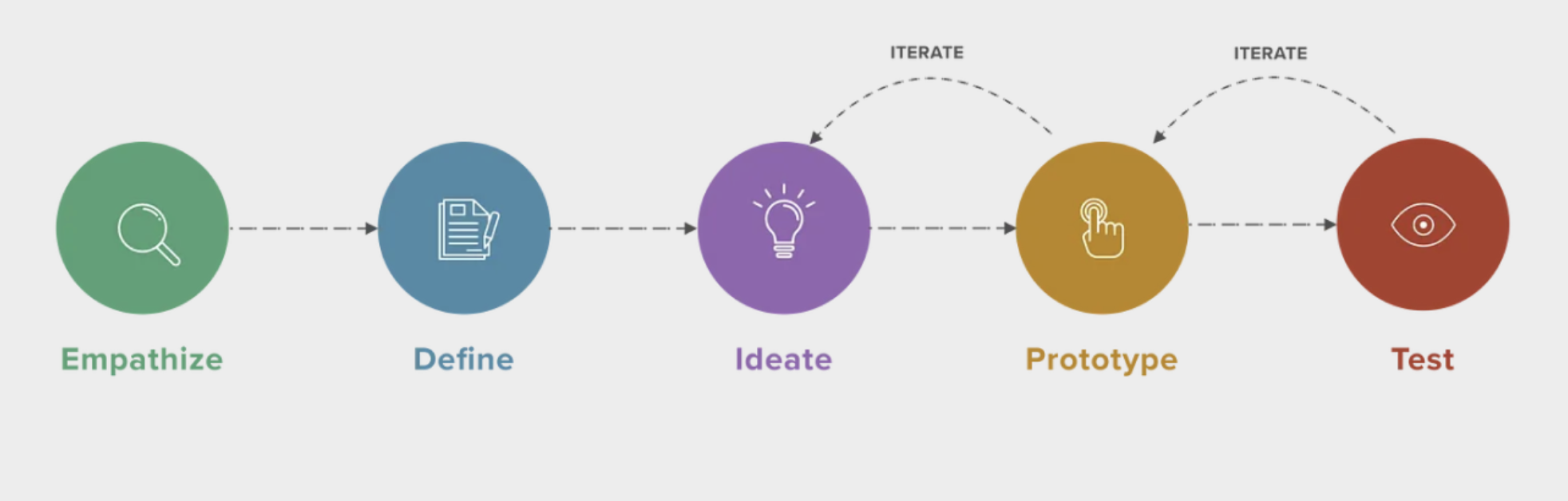
Empathize
Performing a competitive analysis of popular map and review platforms revealed that Google and Apple Maps dominate usage, but both have limitations: reviews can be outdated, biased, or incomplete, and neither fully captures what a place feels like. Interestingly, there was a roughly even split between Apple and Google Maps users, showing no single dominant platform.
Interviews with five participants confirmed that people rely on maps not just for directions, but to decide where to go and what to expect. Trust often comes from word-of-mouth, social media, or visuals rather than reviews alone. Participants wanted a more holistic view, combining practical details with the overall experience, highlighting a clear need for a more comprehensive digital solution.
Research & Insights
Which online resources help users evaluate amenities today?
From the insights gathered during user interviews, I synthesized key behaviors and goals into two representative personas below, helping guide design decisions.
User Personas


The core opportunity emerged from a shared pain point uncovered in user interviews: How do you “read” a neighborhood without physically being there?
While Google and Apple Maps list amenities, the information isn’t structured in a way that lets users filter effectively or understand what some amenities actually mean. Insights from the personas helped clarify that users want a way to scout places tailored to their specific needs, not just a list of facts.
For this project, I anchored the experience around those trying to evaluate neighborhoods and spaces remotely, ensuring the design addresses both practical details and the overall feel of a place.
Design Goals & Strategy
Define
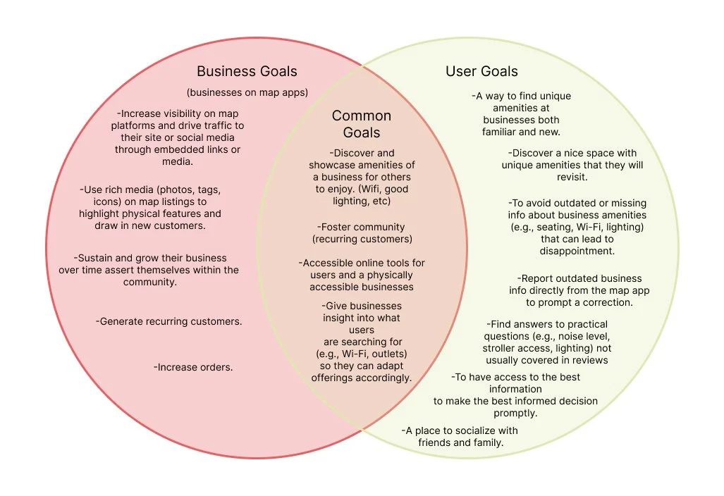
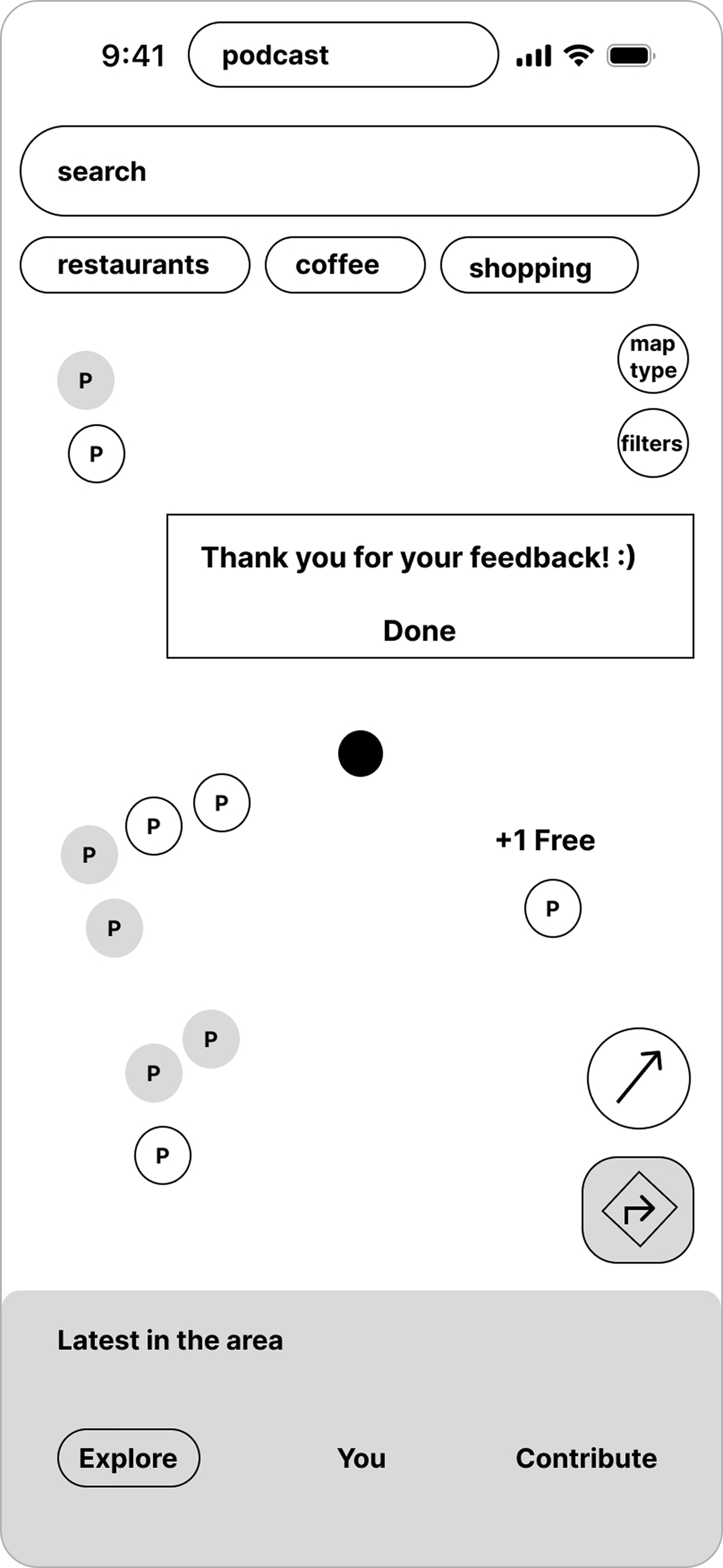
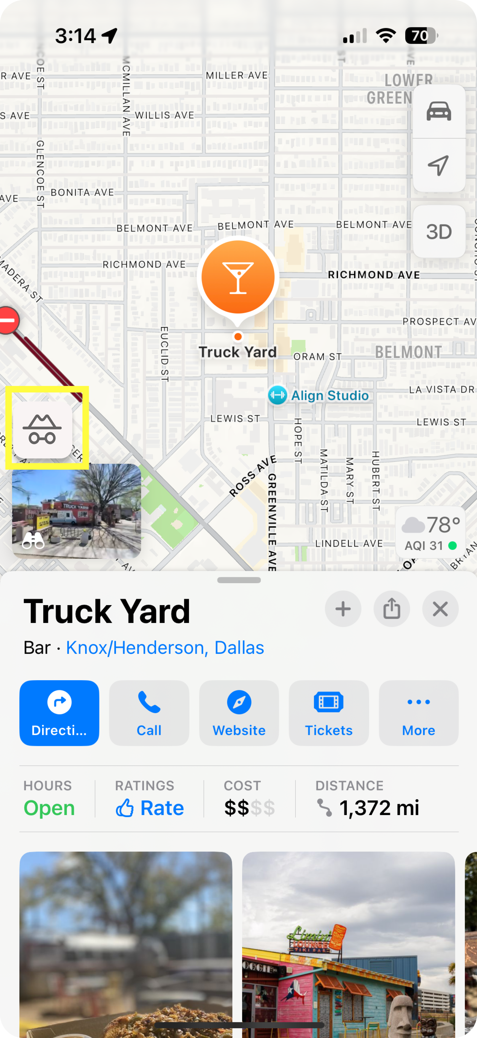
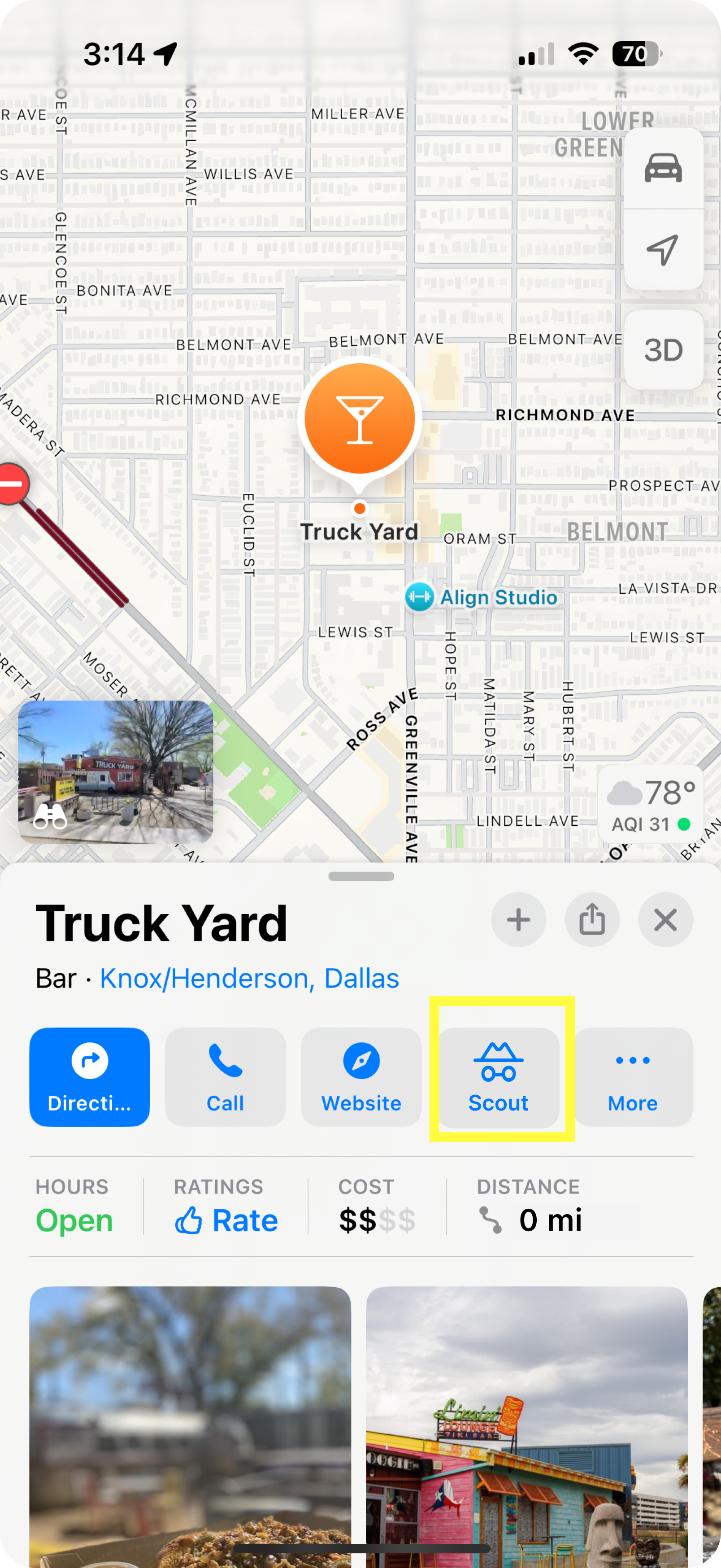
The simple goal of Scout is to act as a new tab within Apple Maps, helping users filter and explore the amenities of every business on the map.
Scout combines editorial content, visual highlights, and real local input to give users a “pre-exploration” view of a place.
My strategy focuses on effortless discovery, integrating seamlessly with Apple’s ecosystem while keeping the experience visual, fast, and exploration-driven.
Ideate
With a clearer understanding of user expectations and the differences in how Apple and Google Maps present information, I began shaping the first concepts for the Scout feature.
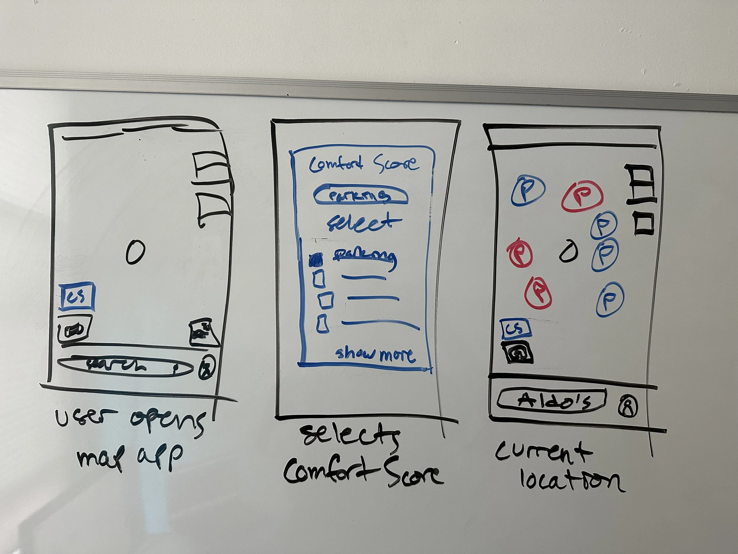
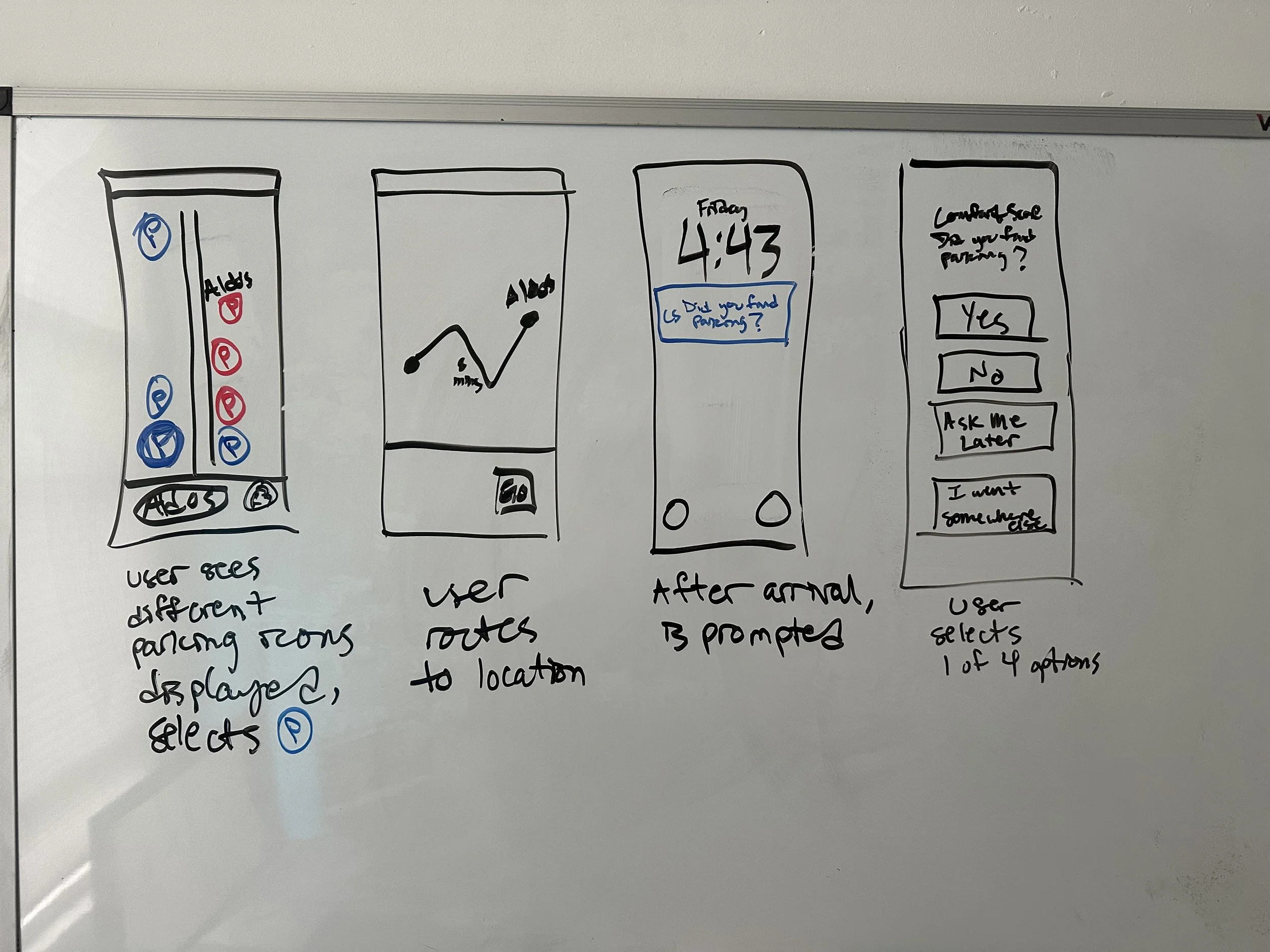
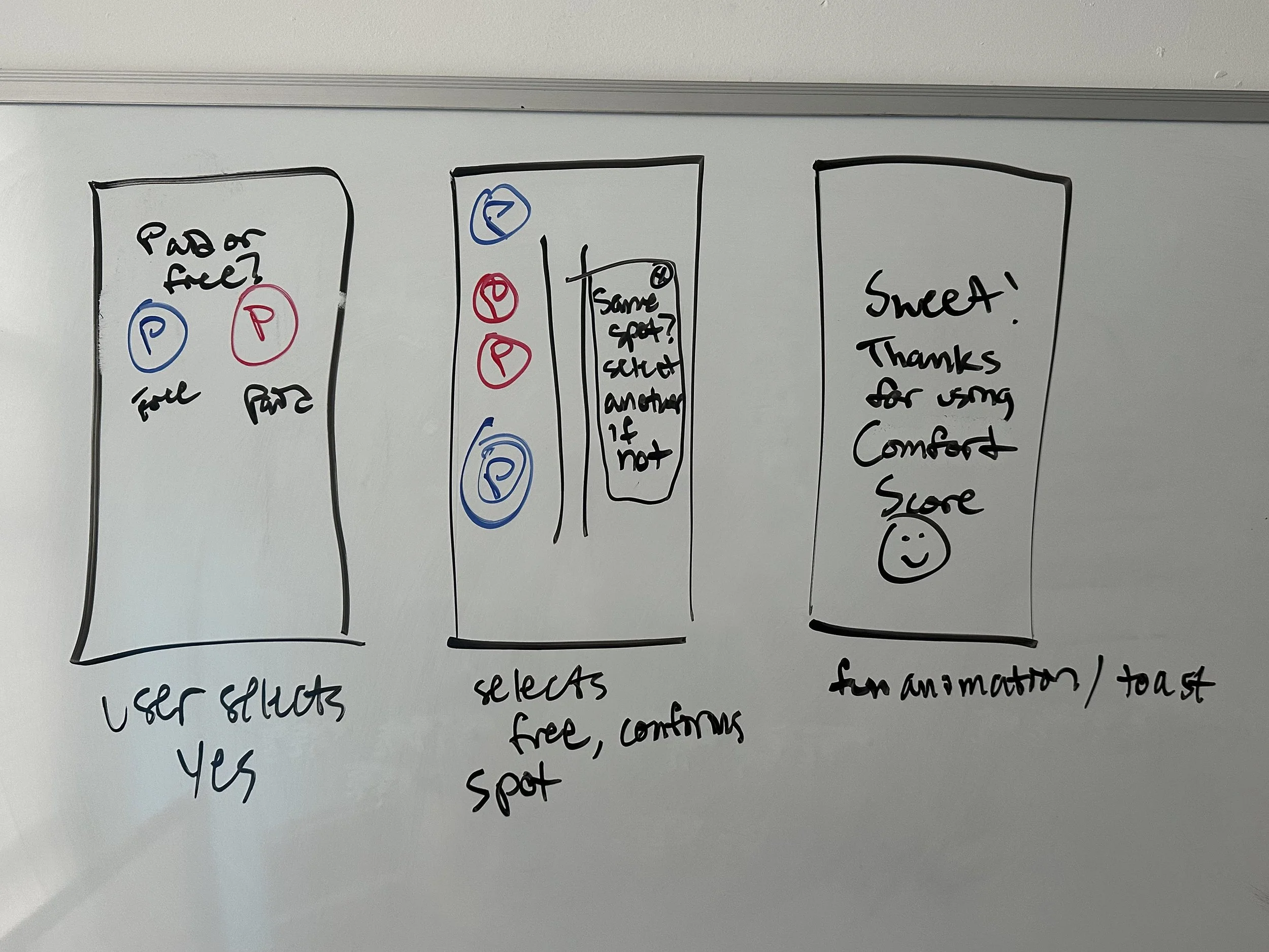
I start every project with quick sketches to establish the core flow before moving into Figma. This helps me explore multiple directions rapidly and stay focused on user needs rather than UI details.
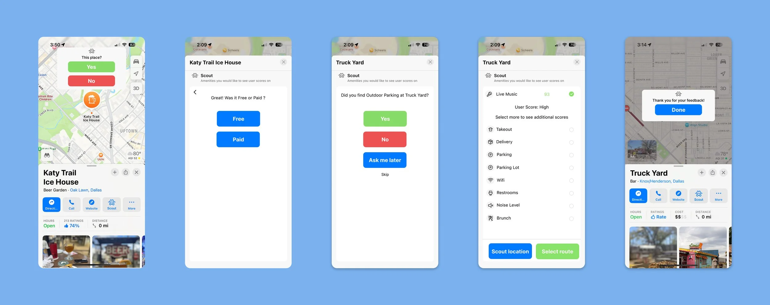
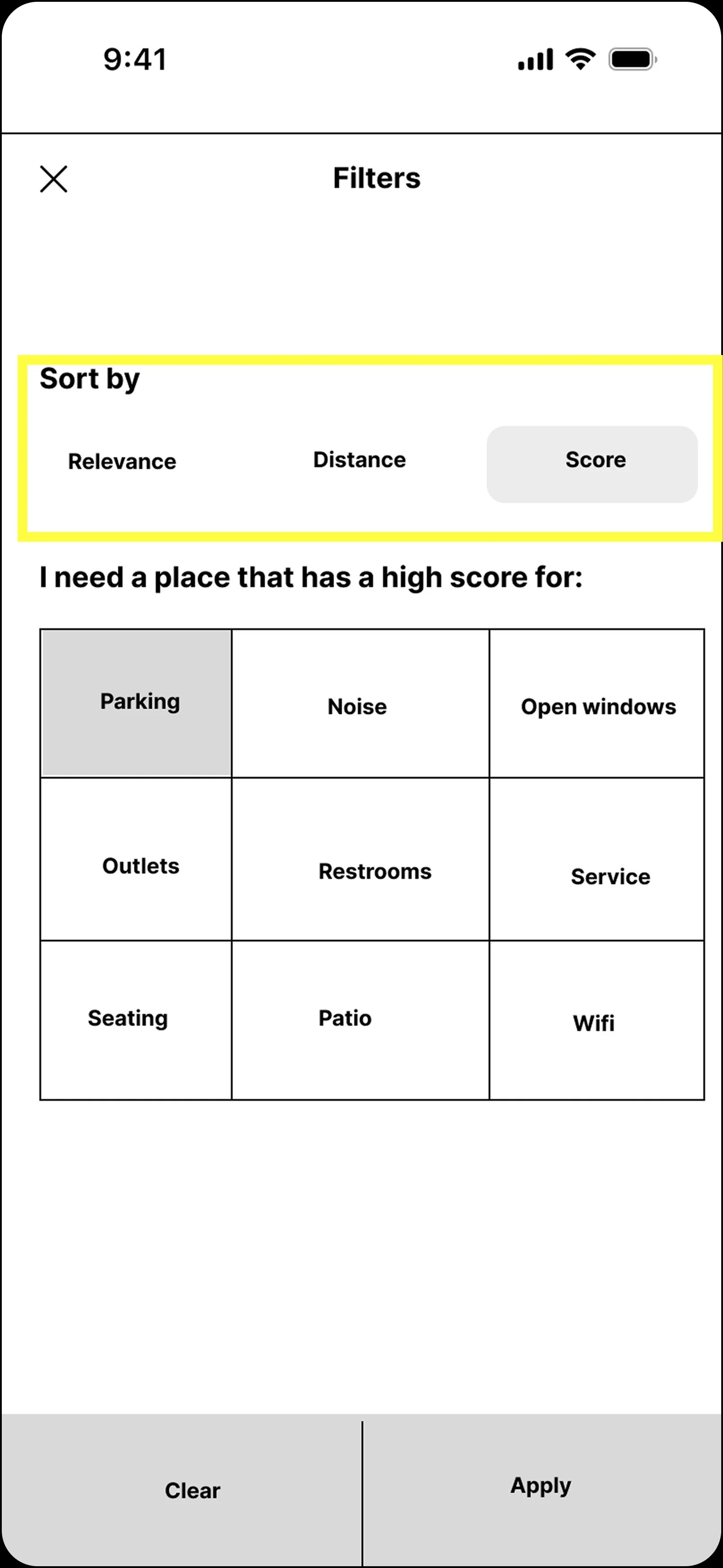
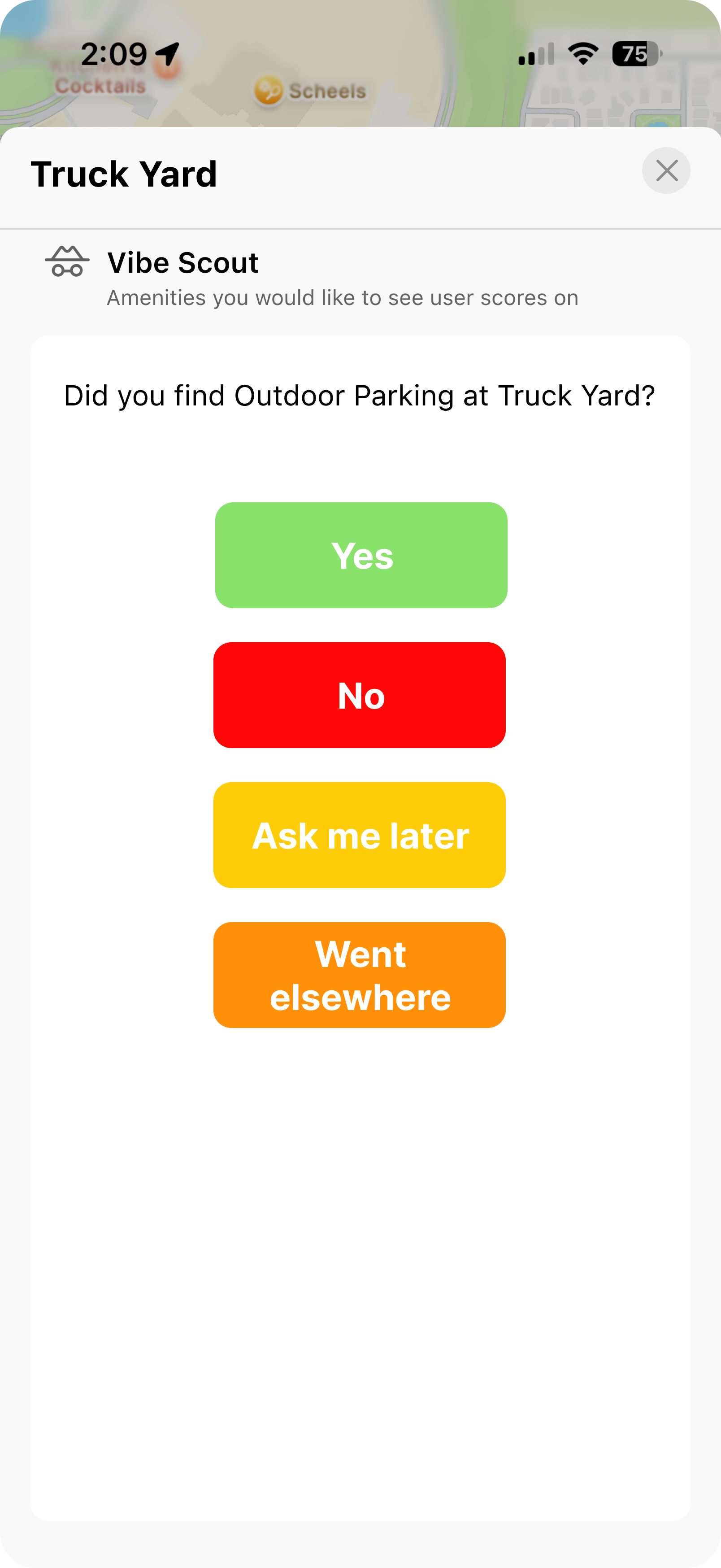
In the early sketches, this feature was called “Comfort Score.” I looked to familiar patterns across other apps to create visual cues that would make the feature instantly understandable for first-time users: a way to narrow down destinations based on their specific needs.
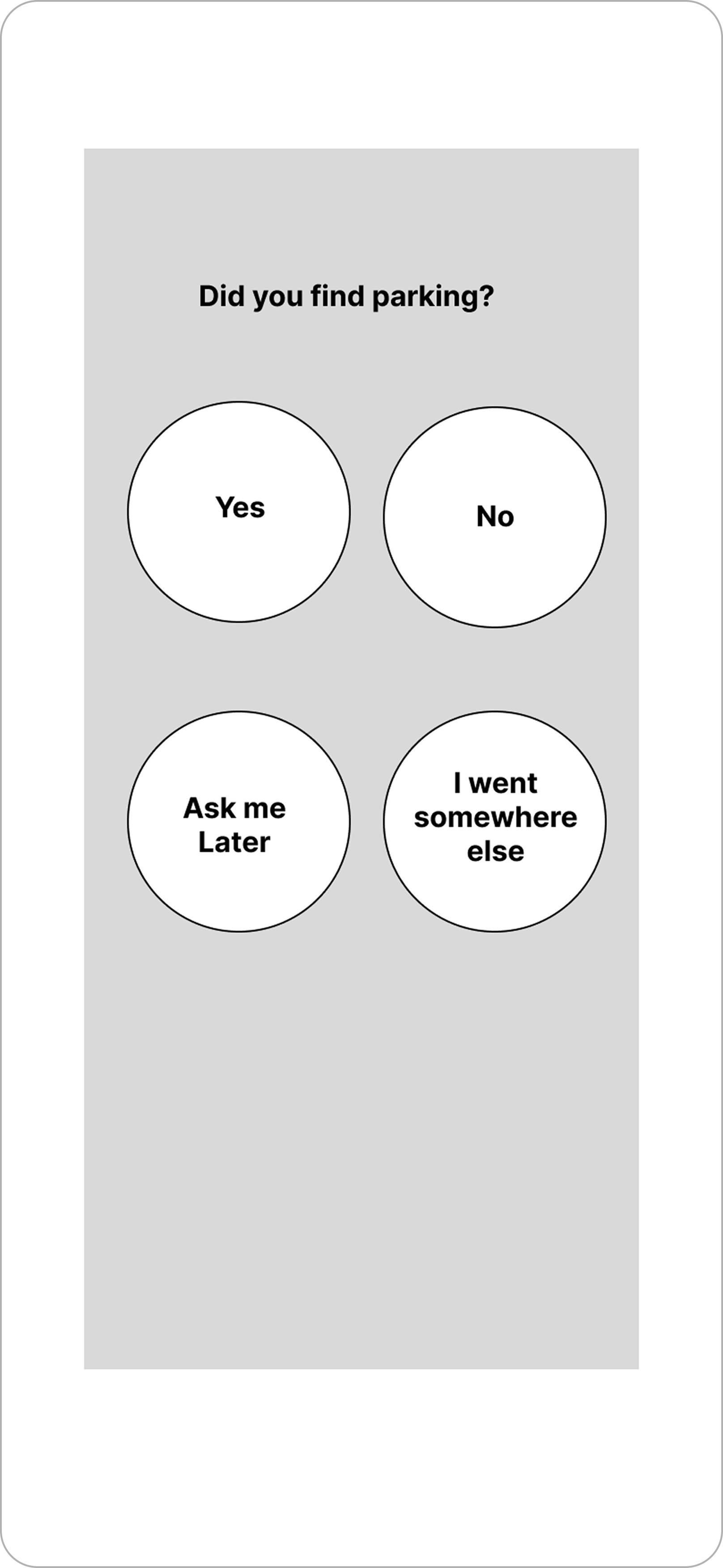
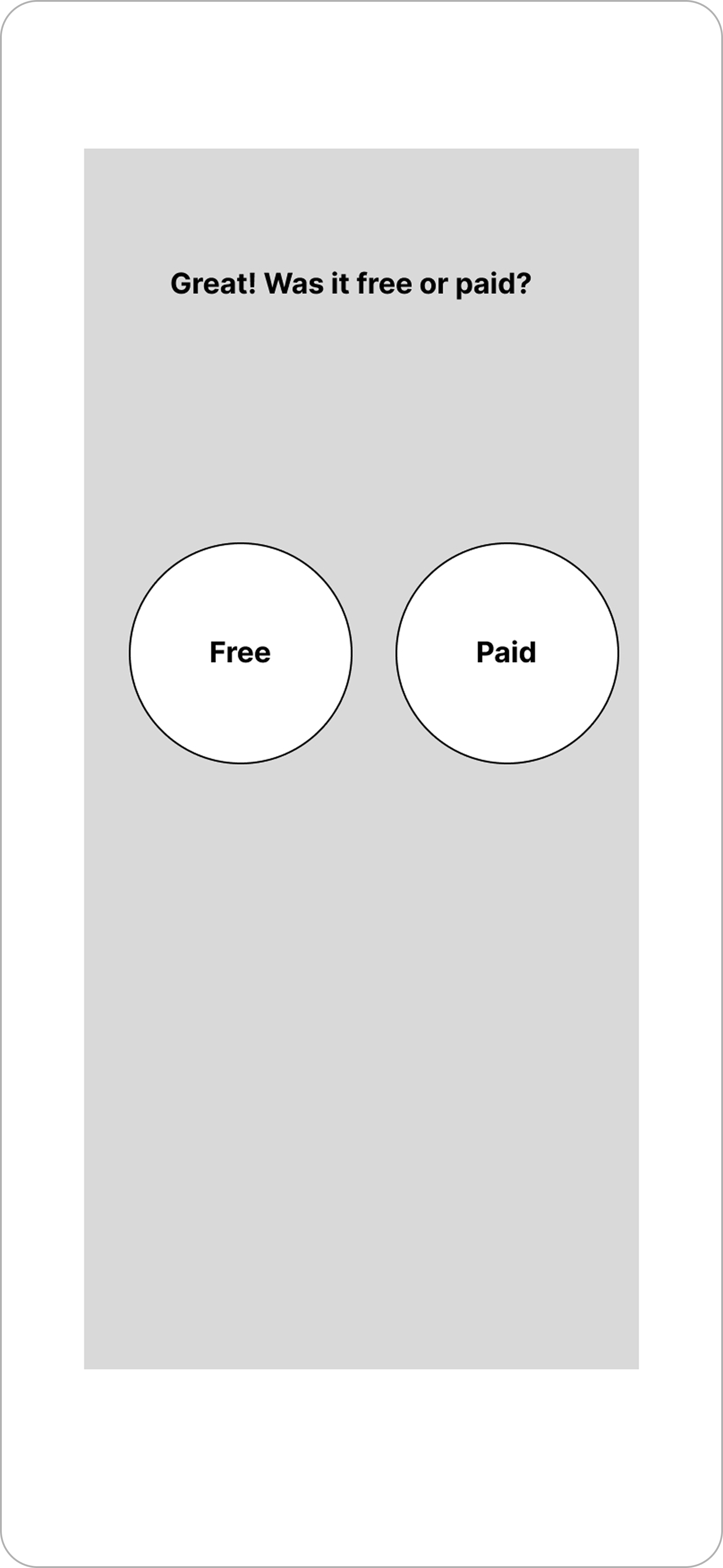
One key challenge at this stage was designing the feedback submission flow. Once users arrive at a destination, they don’t want to fill out a long survey or do anything that feels tedious. My goal was to create a lightweight, low-effort interaction, simple enough to complete quickly, but still useful enough to generate meaningful inputs for future users.
Sketches to Screens
Prototype


Test
I conducted seven usability tests on the initial lo-fi prototype; five moderated sessions, two unmoderated sessions. Participants were asked to complete five scenarios focused on discovering and evaluating amenities using the “Comfort Score” filter and feedback system.
Test Scenarios
Apply the “Comfort Score” filter while searching for an amenity.
2–5. Provide feedback based on their experience at the location (e.g., “Yes, the parking was free” or “No, I didn’t find what I expected”).
Each response affected the amenity’s score for the business.
Key Findings
Confusion around the term “Score.”
User Testing
Google Maps
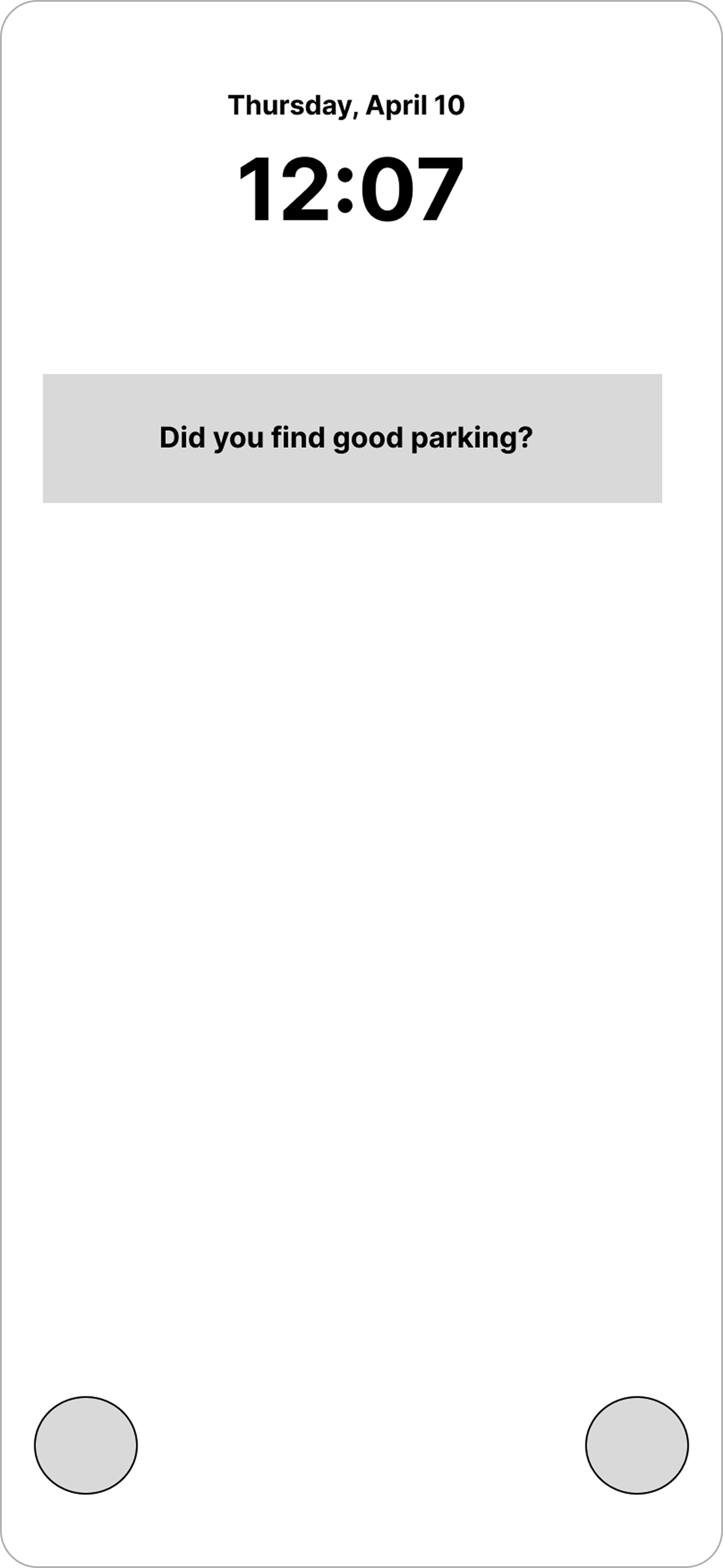
“Comfort Score” Lo-Fi
in Google Maps.
Users struggled most with the first flow (filtering by “Comfort Score”), and this scenario scored below 70% success. Several participants said the naming didn’t clearly communicate what it did. Feedback flows performed extremely well.
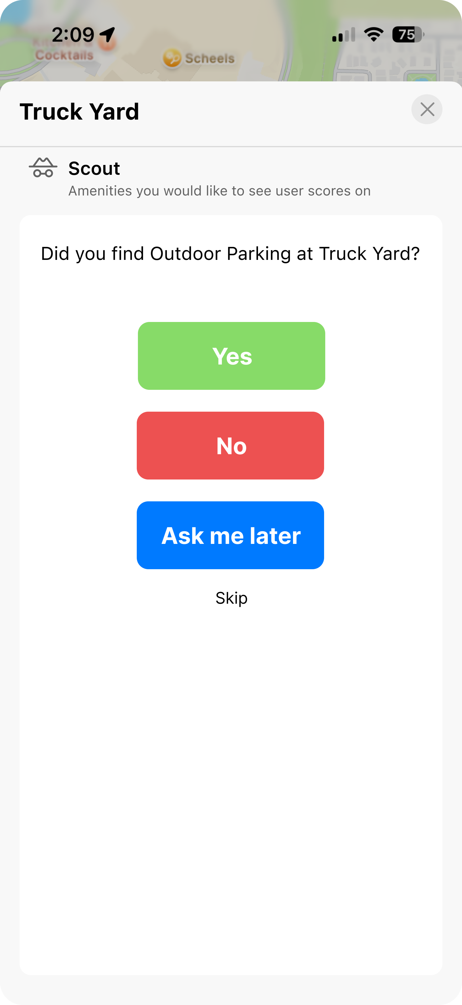
Once users reached their destination screens, the feedback interactions tested at 100% success across participants. These were intuitive, quick, and clearly understood.
Design Implications:
The original UI was based on Google’s visual language, but it wasn’t translating well, users expected different behaviors and interaction patterns.
Based on testing, I pivoted to an Apple-inspired design system for the hi-fi stage. I also reworked the “Comfort Score” concept with clearer naming and more distinct iconography, eventually evolving into “Vibe Scout”.
Before
After
Before
After
Final high-fidelity iteration.
Overall, the core concept remained strong despite iterations from "score" to "scout." For this feature to reach its full potential, I would need to refine my Figma files further, along with additional testing to ensure it truly matches the look and feel of Apple's design system.
Once the files are refined and further testing is complete, securing a software engineer for implementation and maintenance would be the next priority.
Helping users discover their most valued amenities on Apple Maps reinforced how small design decisions can drive engagement, enhance trust, and improve usability. Real users highlighted the need for clear terminology and simplicity when discovering and using the Scout feature—solutions should feel intuitive and effortless.
This project reaffirmed that great design isn't just about solving problems; it's about crafting experiences that build lasting trust.
Thanks for reading!