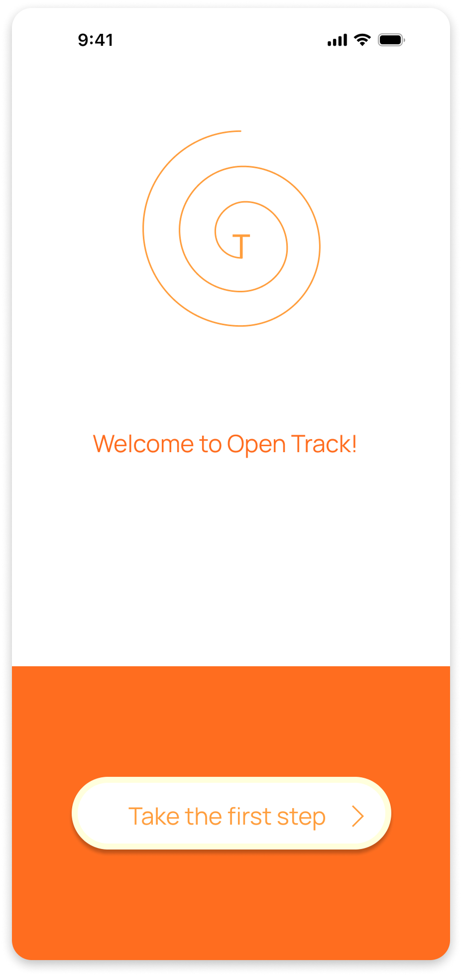
Open Track
Designing a learning app that helps users stay motivated, consistent, and on their own track.
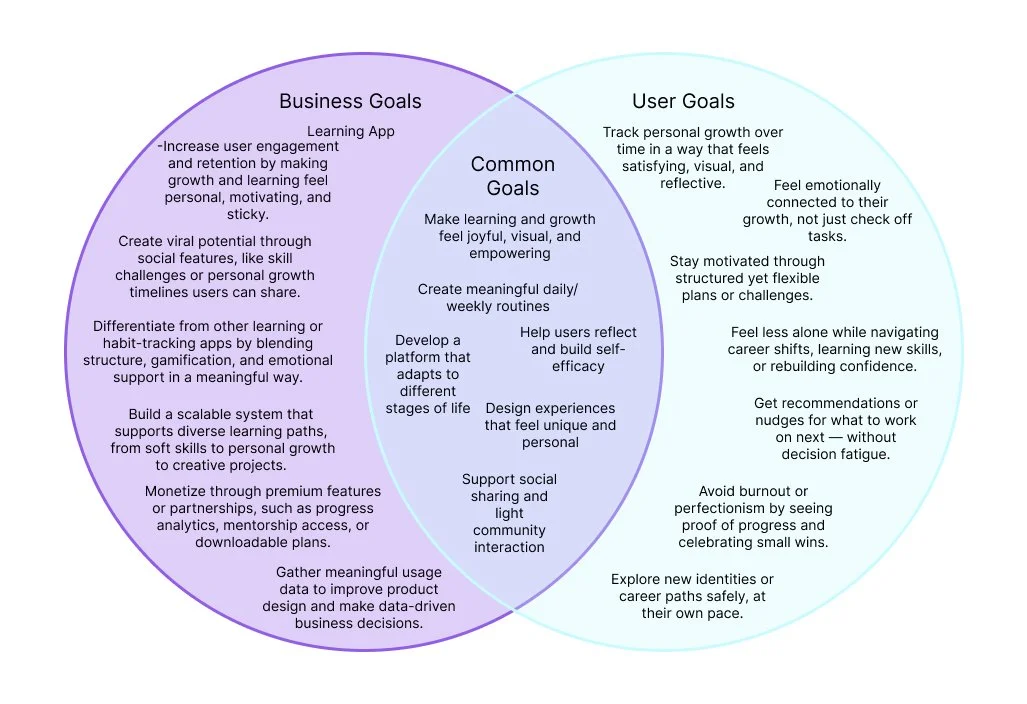
Open Track helps busy learners stay engaged and make measurable progress, by combining AI-driven personalization with focused learning paths designed to remove friction and build lasting habits.
People have more ways to learn than ever, yet many struggle to stay consistent. Adults want to build skills and stay curious, but motivation fades when learning feels overwhelming, rigid, or disconnected from daily life.
Through remote interviews with five adults, students, young professionals, and creative hobbyists, I found that traditional learning platforms often fail to meet users where they are. Despite different goals and schedules, participants shared a desire for learning that felt flexible, personal, and easy to return to during busy weeks.
They valued guidance, small wins, and a sense of support over long lessons or strict curricula. These insights shaped the core product vision: a learning experience that adapts to the user, not the other way around.
Discovery
How might we create a learning app that helps people build meaningful, consistent learning habits in a way that feels personal, achievable, and supported every day?
The Process
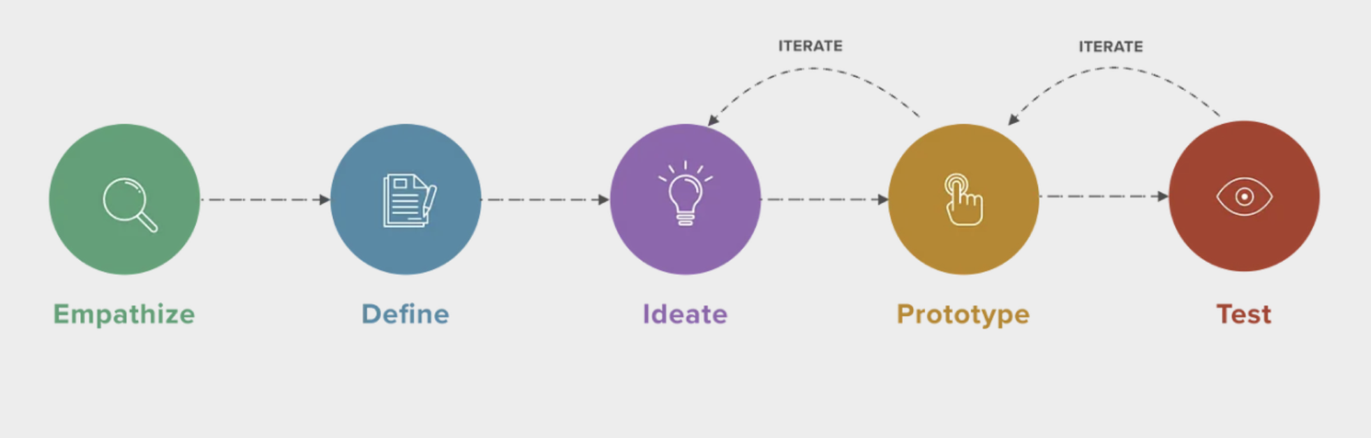
Empathize
To understand the challenges people face with daily learning and habit formation, I examined the current landscape of digital learning tools. A competitive analysis of apps like Duolingo, Lumosity, Headspace, and Elevate showed a common pattern: while these platforms offer structure and gamification, many fall short on personalization, sustained motivation, and long-term engagement.
To ground these findings in real user behavior, I conducted semi-structured remote interviews with five adults from diverse cultural and professional backgrounds. Participants discussed what motivates or discourages them from learning, their experiences with existing tools, and the barriers that make consistency difficult. Across interviews, users consistently expressed a desire for learning that feels sustainable, emotionally rewarding, and aligned with their personal rhythms, revealing a clear opportunity to rethink how self-guided learning is supported.
Research & Insights
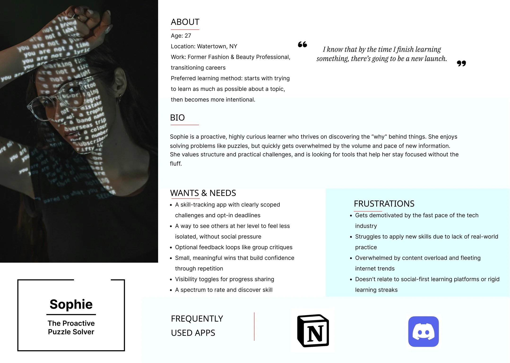
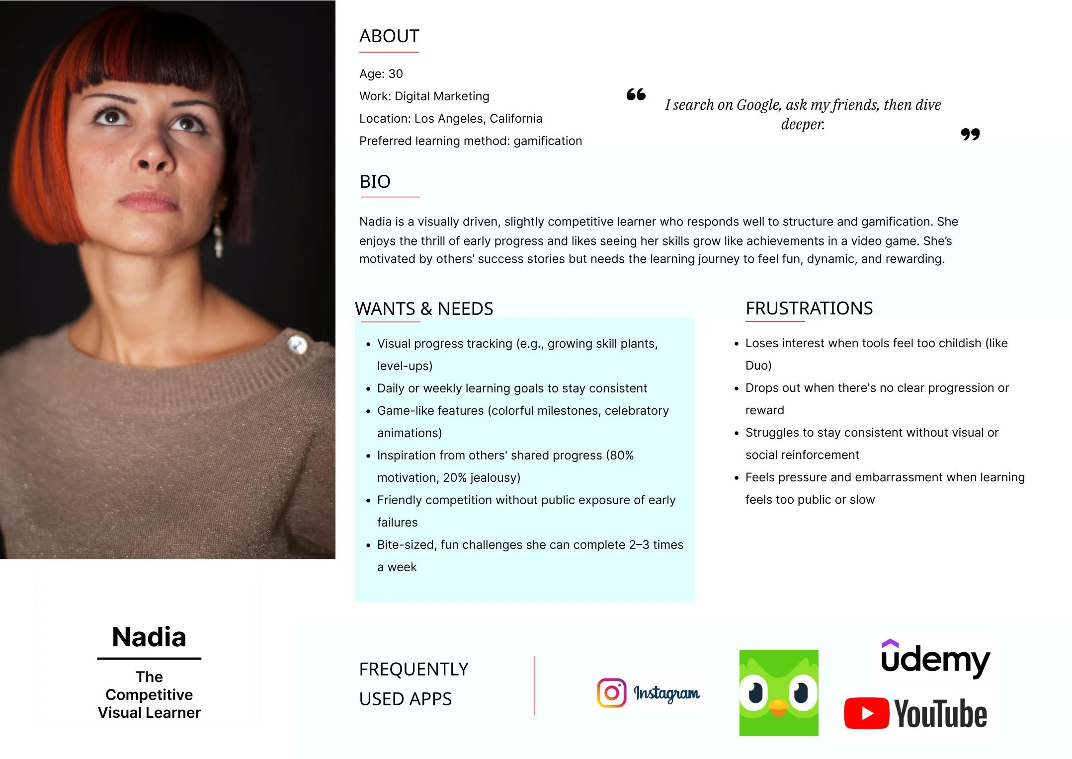
From the insights gathered during user interviews, I synthesized key behaviors and goals into two representative personas below, helping guide design decisions.
User Personas
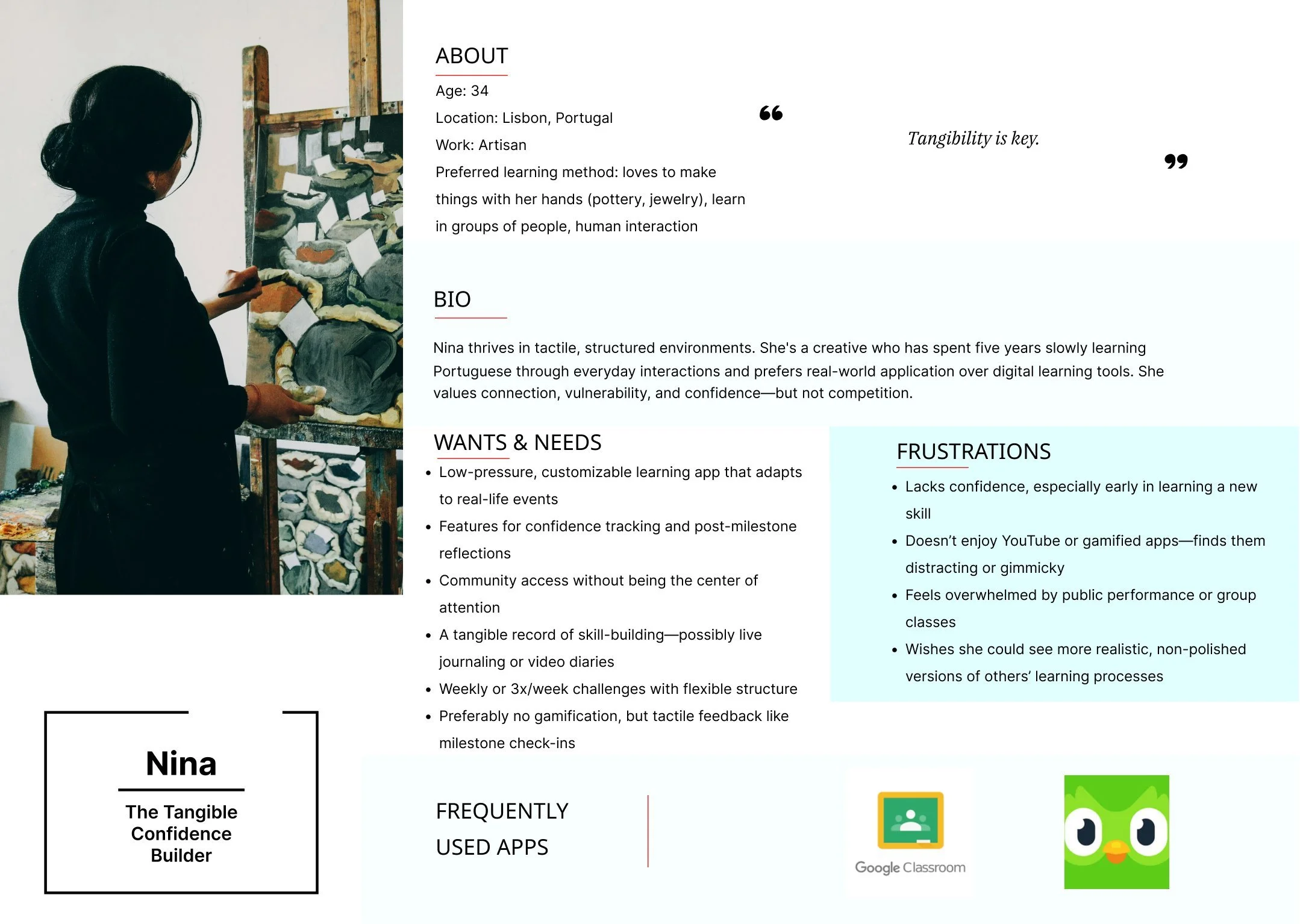
Deeper Insights:
The research revealed a fascinating paradox at the heart of modern learning: while nearly every participant expressed genuine enthusiasm for acquiring new skills, they consistently struggled with the follow-through. The culprit wasn't lack of interest, it was the overwhelming nature of choice and commitment that traditional platforms demanded. One user perfectly captured this sentiment, explaining that existing platforms "feel like committing to a semester of homework," highlighting how the course-centric model had become a barrier rather than a bridge to learning.
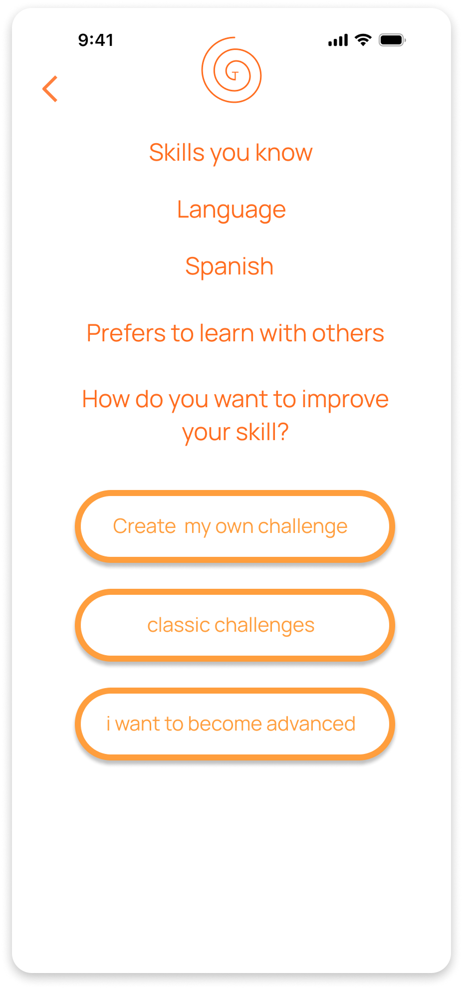
What emerged instead was a clear desire for learning that felt more like daily self-care than academic obligation. Participants gravitated toward the idea of flexible tracks aligned with personal goals—"Creative Confidence" or "Level Up at Work"—that could provide structure without rigidity. Most telling was their relationship with progress itself: users cared less about mastering content and more about maintaining forward momentum, finding visual progress indicators and streak systems genuinely motivating. The social element proved equally nuanced—while some craved optional accountability and shared challenges, others preferred solo learning without pressure, revealing the need for a solution that could gracefully support both learning styles.
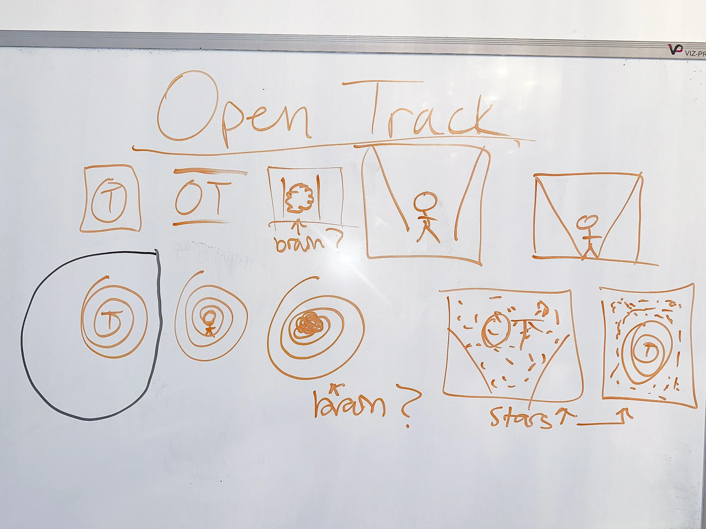
Open Track’s design strategy was shaped directly by user research. Instead of applying a rigid framework, I allowed patterns in real learning behavior to guide decisions, iterating between ideation, prototyping, and testing as insights emerged.
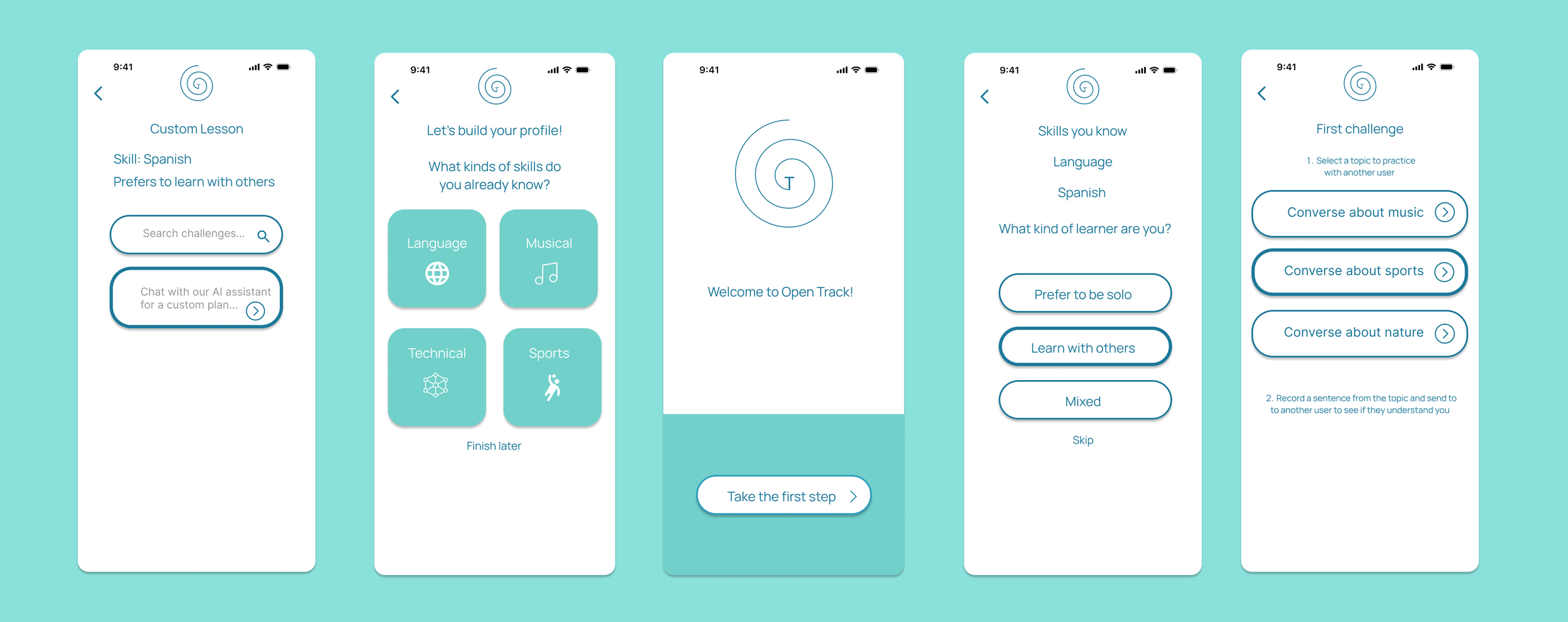
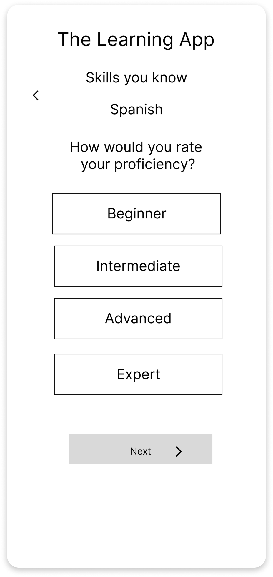
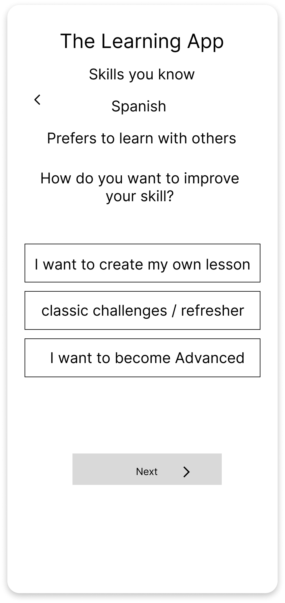
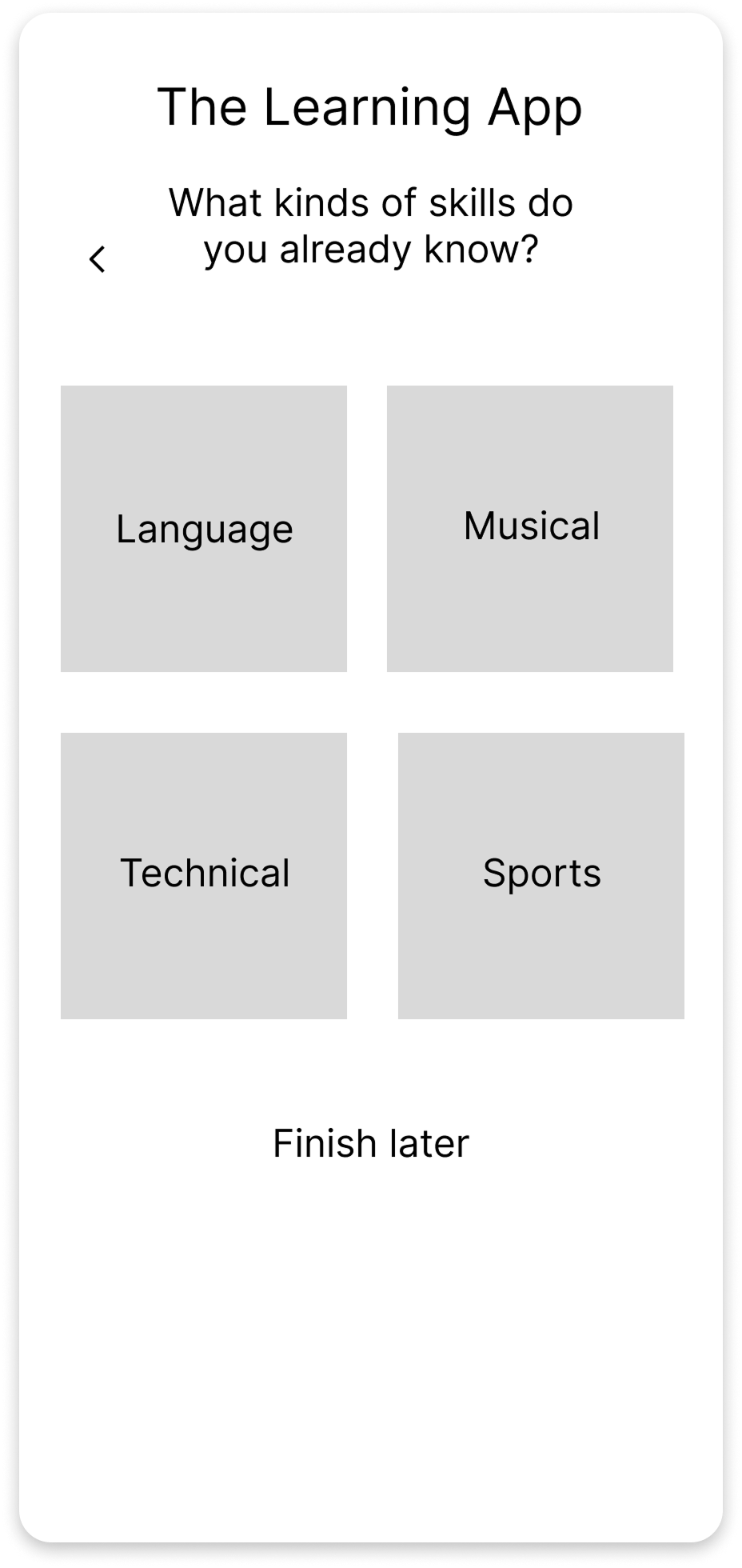
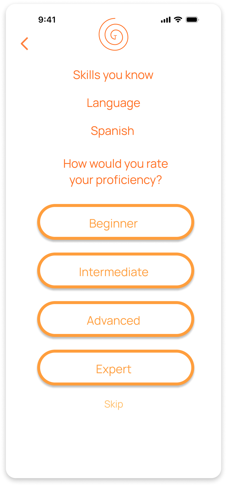
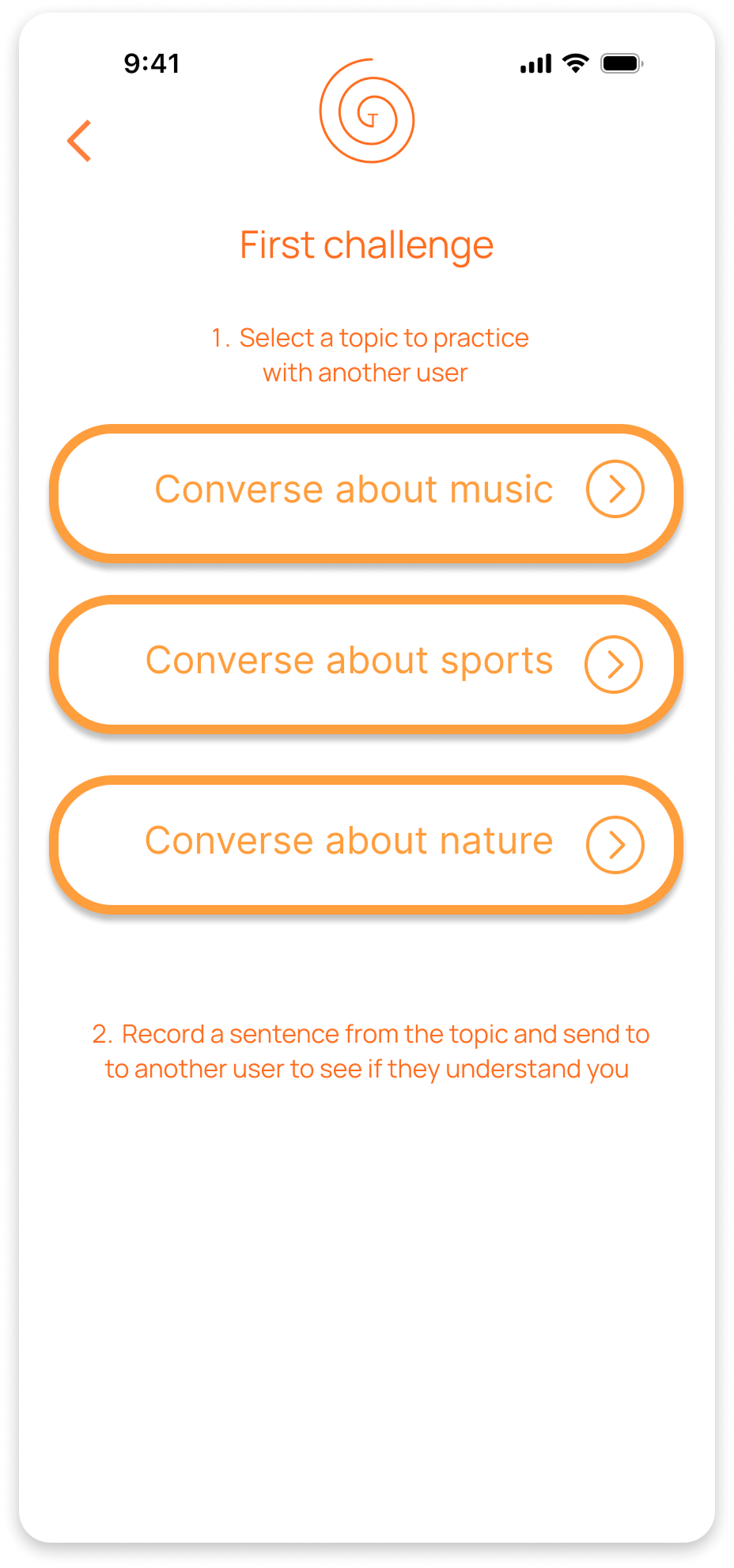
Early sketches clarified the app’s core structure, particularly challenge flows and daily learning organization. These concepts evolved into low-fidelity wireframes that defined hierarchy, navigation, and key interactions, and later into high-fidelity designs focused on clarity, habit support, and personalization.
User feedback drove several critical decisions. Features like reflective prompts were explored but removed when they felt burdensome rather than motivating. In contrast, elements such as visible progress, flexible challenge creation, and lightweight daily prompts were prioritized because they aligned with how users naturally stay engaged and build consistency.
Design Goals & Strategy
Define
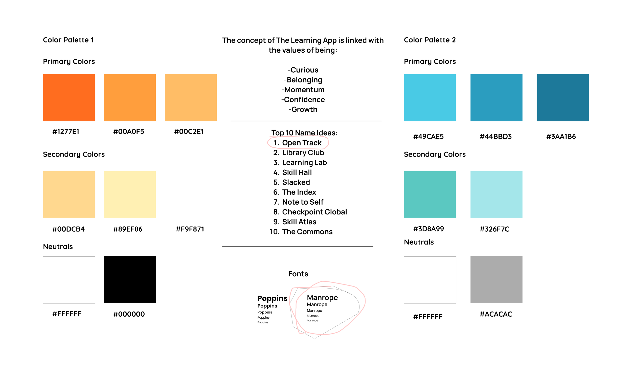
The visual identity for Open Track began with exploring how learning could feel flexible, personal, and encouraging. The name reflects that spirit, an open path users can shape at their own pace, while early logo concepts played with themes of movement and growth.
Sketches to Screens
Ideate
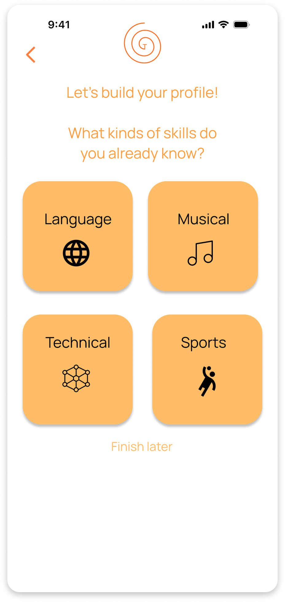
Brand development moved in tandem with wireframing. Initial mood boards and style explorations experimented with warm, motivational tones, but accessibility testing quickly revealed contrast issues. This prompted a thoughtful shift toward a calming blue palette that remained inviting while meeting WCAG standards.
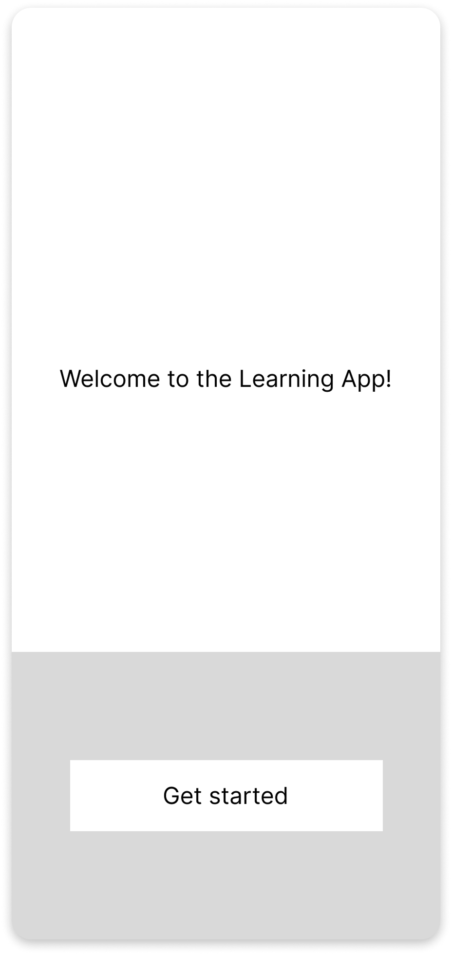
With the visual direction in place, I translated early sketches into low-fidelity wireframes to define structure, hierarchy, and core interaction patterns. These then evolved into the first high-fidelity screens, establishing the foundation for the interactive prototype.
Prototype
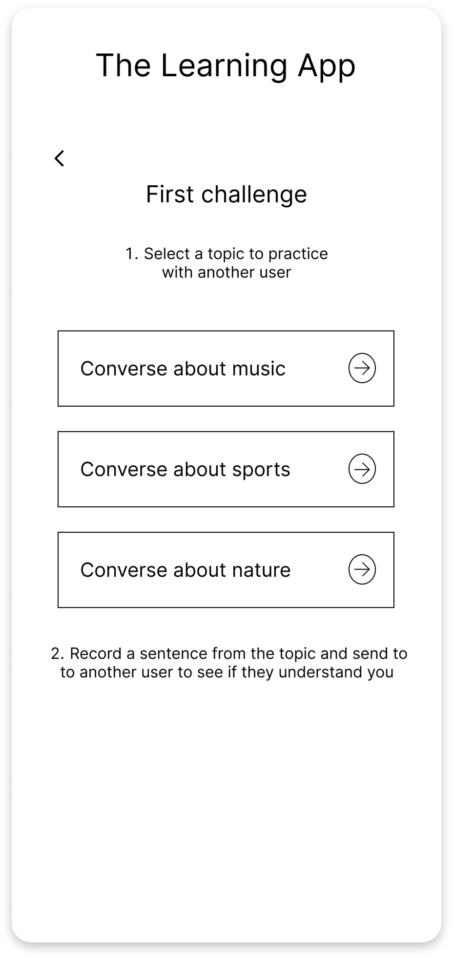
I validated the early direction for Open Track through a mix of moderated and unmoderated testing. The first round, live sessions using low-fidelity wireframes, was the most revealing. Watching users move through the challenge-creation flow in real time surfaced friction I wouldn’t have caught on my own, especially around navigation clarity and the steps required to build a daily challenge.
Once the high-fidelity prototype was ready, I shifted to unmoderated tests to gather broader impressions. While the asynchronous format limited the depth of insights, the overall reactions were positive: users described the experience as “refreshing,” and “clear”.
Across both methods, three themes consistently emerged:
• Simplify the challenge-creation flow
• Clarify button hierarchy and action language
• Strengthen progress visibility through the Growth Map and Stats
These insights directly shaped the second iteration of the interface and set the foundation for ongoing refinement as the product evolves.
User Testing
Test
I received some feedback that the orange in the original design may not meet all accessibility standards, so I changed it to this slightly darker blue, am still considering further color refinement.
Open Track taught me that people learn best when they feel supported, understood, and in control of their own pace. User research made it clear that learning can be deeply personal for some and social for others, and designing for both needs became one of the most rewarding parts of the project.
Working within tight timelines pushed me to trust the design process, moving quickly from concept to testing, making decisions based on real user behavior, and letting go of perfection in favor of clarity and momentum. If I could restart, I’d streamline early ideation to allow even more time for testing, but I’m proud of the strong, scalable foundation this version established.
Looking ahead, I plan to refine Open Track’s challenge structure, strengthen discovery features, and continue exploring AI-powered personalization. This project reaffirmed my ability to learn fast, adapt quickly, and stay open to unexpected insights, skills I bring into every design challenge with curiosity and conviction.